Analysing Nanostring’s GeoMx transcriptomics data using standR, limma and vissE
Ning Liu
Bioinformatics Division, Walter and Eliza Hall Institute of Medical Research, Parkville, VIC 3052, AustraliaDepartment of Medical Biology, University of Melbourne, Parkville, VIC 3010, Australialiu.n@wehi.edu.au
Chin Wee Tan
Bioinformatics Division, Walter and Eliza Hall Institute of Medical Research, Parkville, VIC 3052, AustraliaDepartment of Medical Biology, University of Melbourne, Parkville, VIC 3010, Australiacwtan@wehi.edu.au
Melissa J Davis
Bioinformatics Division, Walter and Eliza Hall Institute of Medical Research, Parkville, VIC 3052, AustraliaDepartment of Medical Biology, University of Melbourne, Parkville, VIC 3010, AustraliaDepartment of Biochemistry and Molecular Biology, Faculty of Medicine, Dentistry and Health Sciences, University of Melbourne, Parkville, VIC, 3010, Australiadavis.m@wehi.edu.au
Nov 2023
Source:vignettes/GeoMXAnalysisWorkflow.Rmd
GeoMXAnalysisWorkflow.Rmd
R version: R version 4.3.2 (2023-10-31)
Bioconductor version: 3.18
Background and introduction
Nanostring GeoMx data
Nanostring’s GeoMx DSP data comes from the GeoMx DSP workflow which
integrates standard pathology and molecular profiling to obtain robust
and reproducible spatial multiomics data. DSP data typically comes from
whole tissue sections, FFPE or fresh frozen samples. These can be imaged
and stained for RNA or protein. The selected regions or
areas of interests will have their count expression levels
quantified using either the nCounter Analysis System or an Illumina
Sequencer.
GeoMx RNA assays allows quantitative and spatial measurements of transcripts (up to the whole transcriptome) from single sections of FFPE or fixed fresh frozen tissues. Typical gene panels utilised include the Cancer Transcriptome Atlas (CTA, ~1800 genes) and Whole Transcriptome Atlas (WTA, ~18000 genes).
Count data are generated from the DSP pipeline and technically pre-processed using the GeoMx Data Analysis Suite (DSPDA). This includes the removal of low performing probes and calculation of a typical QC metric called LOQ using the negative probes. Data normalization is typically conducted based on recommendations from Nanostring by the technologist/technicians with a suggested Q3 normalized data output.
Note: Q3-normalized data is not recommended for any bioinformatics workflow or pipeline. Rather, the technical probe corrected counts (probeQC, which accounts for any technical machine systematic errors during the DSP run) is recommended.
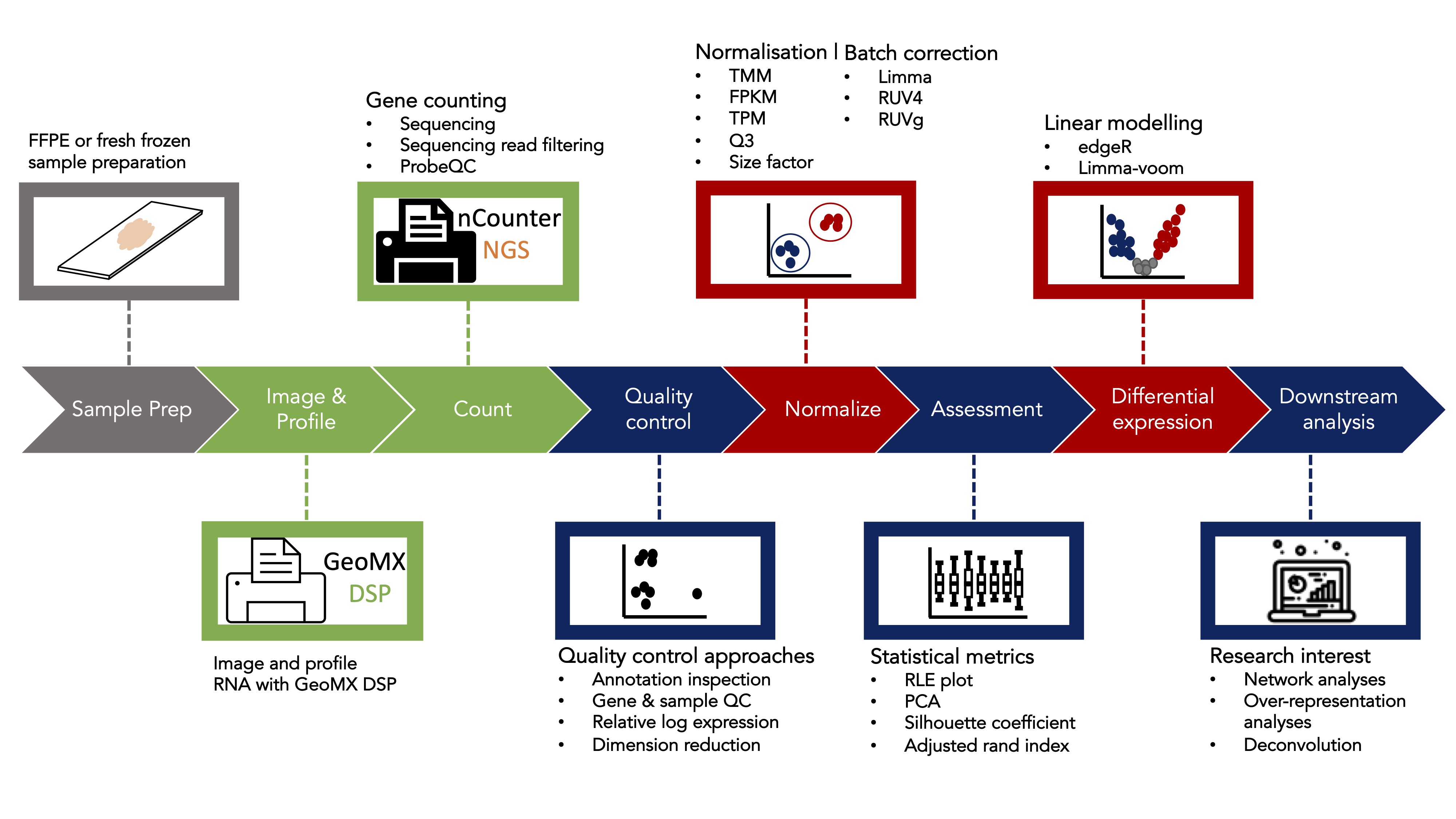
Analysis of spatial GeoMx datasets
A typical bioinformatics analysis of a GeoMx DSP dataset often starts
with a count table (from sequencing reads of genes for each region of
interest (ROI)), and ends with either identifying differential expressed
genes or performing gene signature/gene-set scoring pathway/enrichment
analyses in various conditions or experimental designs. Nevertheless,
before performing any differential expression (DE) analysis or other
downstream analyses that are based on the gene counts, proper quality
control(QC) and normalization of the data is essential and if not done
properly, will greatly impact the correctness and validity of the DE and
corresponding downstream analysis’ results. We therefore developed a
bioconductor package called standR
(Spatial transcriptomics
analyzes and decoding
in R) to assist the QC, normalization and batch
correction of the GeoMx transcriptomics data.
There are three major advantages of using the standR
package to analyse the GeoMx DSP datasets:
The package uses the
SpatialExperimentinfrastructure to analyse the data. This infrastructure is a lineage of theSummarisedExperimentfamily, which is highly recommended in the bioconductor community. It is compatible and transferable with many other well developed packages in the RNA-seq analysis world, such asscater,scran,edgeRandlimma.The package features a comprehensive route for quality control, and provides various visualisation functions to help in the assessment of the various quality control metrics.
Batch effect is a common feature in transcriptomic datasets, especially in GeoMx DSP data due to the way the slides are typically utilised due to experimental constrains/designs. The package currently provides three batch correction methods that will remove the unwanted batch effect and provides statistics for assessing the correction process and outcomes.
In this workshop, we will firstly use standR to process
and analyse a published GeoMx WTA dataset using the recommended
workflow. This will demonstrate our recommended workflow for processing
and analysing GeoMx transcriptomics datasets. Secondly, we will perform
DE analysis of the processed data using the limma-voom
pipeline, followed by a gene-set enrichment analysis using
fry and subsequent visualisation of the higher order
results using the R package vissE.
Using standR to process and analyse GeoMx transcriptomics data
Load data
The data we are using in this workshop is a published GeoMx whole transcriptome atlas (WTA) dataset of Lymph node tissue that was made available by Nanostring’s Spatial Organ Atlas (https://nanostring.com/products/geomx-digital-spatial-profiler/spatial-organ-atlas/).
This dataset includes data on five slides. The ROI selection strategy employed is a regional based approach focused primarily on 5 distinct structures found in the lymph node, namely: B cell zone, T cell zone, Germinal center, Medulla and Trabecula.
setwd("~/vignettes/")
library(tidyverse)

countFile <- read_tsv("../inst/extdata/count.txt") %>% as.data.frame()
sampleAnnoFile <- read_tsv("../inst/extdata/metadata.txt") %>% as.data.frame()
featureAnnoFile <- read_tsv("../inst/extdata/genemeta.txt") %>% as.data.frame()
We can have a first look at the format of the three files, which are the typical files made available by NanoString.
The countFile is a tab-delimited file, it contains the
count table (features by samples) we generally see in transcriptomics
analysis. By default as provided by the Nanostring, it is required to
have the gene name column with the column name of “TargetName”.
head(countFile)[,1:5]## TargetName 32 | 001 | Full ROI 32 | 002 | Full ROI 32 | 003 | Full ROI
## 1 H3C13 6 22 12
## 2 ATXN7L1 5 2 6
## 3 TCERG1 6 6 10
## 4 CLIC6 3 1 3
## 5 MAPK1IP1L 23 23 29
## 6 ZNF614 2 10 8
## 32 | 004 | Full ROI
## 1 20
## 2 8
## 3 14
## 4 2
## 5 35
## 6 6The sampleAnnoFile is a tab-delimited file, containing
all the annotation (metadata) for the samples. By default as provided by
the Nanostring, it is required to include the sample name column with
the column name of “SegmentDisplayName”.
head(sampleAnnoFile)[,1:5]## SlideName ScanLabel ROILabel SegmentLabel SegmentDisplayName
## 1 hu_lymph_node_001a 6B 001 Full ROI 6B | 001 | Full ROI
## 2 hu_lymph_node_001a 6B 002 Full ROI 6B | 002 | Full ROI
## 3 hu_lymph_node_001a 6B 003 Full ROI 6B | 003 | Full ROI
## 4 hu_lymph_node_001a 6B 004 Full ROI 6B | 004 | Full ROI
## 5 hu_lymph_node_001a 6B 005 Full ROI 6B | 005 | Full ROI
## 6 hu_lymph_node_001a 6B 006 Full ROI 6B | 006 | Full ROIThe featureAnnoFile is a tab-delimited file, containing
all the annotation (metadata) of the genes in the dataset. By default as
provided by the Nanostring, it is required to include the gene name
column with the column name of “TargetName”.
head(featureAnnoFile)[,1:5]## TargetName HUGOSymbol TargetGroup AnalyteType CodeClass
## 1 H3C13 H3-2,H3P4,H3C13 All Targets RNA Endogenous
## 2 ATXN7L1 ATXN7L1 All Targets RNA Endogenous
## 3 TCERG1 TCERG1 All Targets RNA Endogenous
## 4 CLIC6 CLIC6 All Targets RNA Endogenous
## 5 MAPK1IP1L MAPK1IP1L All Targets RNA Endogenous
## 6 ZNF614 ZNF614 All Targets RNA EndogenousAs described in the introduction, there are many advantages to use a mature infrastructure throughout the analysis, such as compatibility with other tools.
Therefore, the first step in the standR package workflow
is to construct a SpatialExperiment object that includes
all the information available in the data. Here we can use the function
readGeoMX to do so. For more information about the
SpatialExperiment infrastructure, see here.
Note 1: By default, the readGeoMx function will
look for the gene name column in both the countFile and
featureAnnoFile with the column name of “TargetName”, and
the sample name column in the sampleAnnoFile with the
column name of “SegmentDisplayName”, these column names are given by the
Nanostring in the default settings, if your data have been modified, you
can indicate the corresponding column names by specifying the parameter
“colnames.as.rownames” in the readGeoMx function when
loading the data.
Note 2: If you plan to use readGeoMx to
construct the SpatialExperiment object with your own data,
make sure that the files you use as inputs are tab-delimited
files.
spe <- readGeoMx("../inst/extdata/count.txt",
                 "../inst/extdata/metadata.txt",
                 "../inst/extdata/genemeta.txt")
Check the basic information about the dataset by entering the object name directly. We see that the data has measurements for approximately 18676 genes and 190 ROIs.
spe## class: SpatialExperiment
## dim: 18676 190
## metadata(1): NegProbes
## assays(2): counts logcounts
## rownames(18676): H3C13 ATXN7L1 ... FEZ1 PGLS
## rowData names(12): HUGOSymbol TargetGroup ... NumberOfProbesTotal
## GeneID
## colnames(190): 32 | 001 | Full ROI 32 | 002 | Full ROI ... 25337T4(2) |
## 034 | CD20+ 25337T4(2) | 034 | SMA+
## colData names(32): SlideName ScanLabel ... Type sample_id
## reducedDimNames(0):
## mainExpName: NULL
## altExpNames(0):
## spatialCoords names(2) : ROICoordinateX ROICoordinateY
## imgData names(0):Both count-level data and logCPM measurements are stored in the
spatialExperiment object. Specifically, the raw count data
is stored in the counts assay slot, while the log-CPM
(count per million) of the data is calculated by default with the
readGeoMX function and stored in the logcounts
assay of the object.
library(SpatialExperiment)

assayNames(spe)
## [1] "counts" "logcounts"We can have a look at the count table by using the assay
function and specify the table name.
assay(spe, "counts")[1:5,1:5]## 32 | 001 | Full ROI 32 | 002 | Full ROI 32 | 003 | Full ROI
## H3C13 6 22 12
## ATXN7L1 5 2 6
## TCERG1 6 6 10
## CLIC6 3 1 3
## MAPK1IP1L 23 23 29
## 32 | 004 | Full ROI 32 | 005 | Full ROI
## H3C13 20 12
## ATXN7L1 8 4
## TCERG1 14 4
## CLIC6 2 5
## MAPK1IP1L 35 23
assay(spe, "logcounts")[1:5,1:5]## 32 | 001 | Full ROI 32 | 002 | Full ROI 32 | 003 | Full ROI
## H3C13 5.566671 7.361391 5.794760
## ATXN7L1 5.312797 4.028661 4.833464
## TCERG1 5.566671 5.521811 5.539550
## CLIC6 4.611902 3.156275 3.907891
## MAPK1IP1L 7.470903 7.424945 7.044597
## 32 | 004 | Full ROI 32 | 005 | Full ROI
## H3C13 6.487543 6.226214
## ATXN7L1 5.201566 4.698285
## TCERG1 5.983333 4.698285
## CLIC6 3.369000 5.003339
## MAPK1IP1L 7.284459 7.150834Sample metadata is stored in the colData of the
object.
colData(spe)[1:5,1:5]## DataFrame with 5 rows and 5 columns
## SlideName ScanLabel ROILabel SegmentLabel
## <character> <character> <character> <character>
## 32 | 001 | Full ROI hu_lymph_node_001b 32 001 Full ROI
## 32 | 002 | Full ROI hu_lymph_node_001b 32 002 Full ROI
## 32 | 003 | Full ROI hu_lymph_node_001b 32 003 Full ROI
## 32 | 004 | Full ROI hu_lymph_node_001b 32 004 Full ROI
## 32 | 005 | Full ROI hu_lymph_node_001b 32 005 Full ROI
## CD3+
## <logical>
## 32 | 001 | Full ROI FALSE
## 32 | 002 | Full ROI FALSE
## 32 | 003 | Full ROI FALSE
## 32 | 004 | Full ROI FALSE
## 32 | 005 | Full ROI FALSEGene metadata are stored in the rowData of the
object.
rowData(spe)[1:5,1:5]## DataFrame with 5 rows and 5 columns
## HUGOSymbol TargetGroup AnalyteType CodeClass ProbePool
## <character> <character> <character> <character> <character>
## H3C13 H3-2,H3P4,H3C13 All Targets RNA Endogenous 01
## ATXN7L1 ATXN7L1 All Targets RNA Endogenous 01
## TCERG1 TCERG1 All Targets RNA Endogenous 01
## CLIC6 CLIC6 All Targets RNA Endogenous 01
## MAPK1IP1L MAPK1IP1L All Targets RNA Endogenous 01The readGeoMX function has other parameters such as
hasNegProbe and NegProbeName that are designed
to deal with negative probes in the data. In CTA data, there is usually
one negative probe names “NegProbe”, and for WTA data, there could be
one or more negative probes with the same name “NegProbe-WTX”. By
default, the readGeoMx function will remove the negative
probe, the entry with name “NegProbe-WTX”, in the count table and put it
in the metadata of the object. User can turn this off by specifying
hasNegProbe = FALSE in the function, just make sure there
are no duplicate gene names in the “TargetName” column.
metadata(spe)$NegProbes[,1:5]## 32 | 001 | Full ROI 32 | 002 | Full ROI 32 | 003 | Full ROI
## NegProbe-WTX 1.828305 1.434654 2.187668
## 32 | 004 | Full ROI 32 | 005 | Full ROI
## NegProbe-WTX 2.464718 1.747295Import from DGEList object
Alternatively, standR provides a function to generate a
spatial experiment object from a DGEList object, which would be useful
for users who used edgeR package and have existing analyses
and implementations using DGEList objects to port across to the standR
workflow.
dge <- edgeR::SE2DGEList(spe)

spe2 <- readGeoMxFromDGE(dge)

spe2
## class: SpatialExperiment
## dim: 18676 190
## metadata(0):
## assays(2): counts logcounts
## rownames(18676): H3C13 ATXN7L1 ... FEZ1 PGLS
## rowData names(12): HUGOSymbol TargetGroup ... NumberOfProbesTotal
## GeneID
## colnames(190): 32 | 001 | Full ROI 32 | 002 | Full ROI ... 25337T4(2) |
## 034 | CD20+ 25337T4(2) | 034 | SMA+
## colData names(35): group lib.size ... Type sample_id
## reducedDimNames(0):
## mainExpName: NULL
## altExpNames(0):
## spatialCoords names(0) :
## imgData names(0):Check QCFlags
In the meta data file generated by Nanostring, there is a column called “QCFlags”, which indicates bad quality tissue samples in their preliminary QC step. If the data is fine from their QC, you will see NA/empty cells in this column. On the other hand, if you see the any flags in your data, such as:
Low Nuclei Count,Low Negative Probe Count for Probe Kit Human NGS Whole Transcriptome Atlas RNA
Low Nuclei Count
Low Surface Area,Low Nuclei Count,Low Negative Probe Count for Probe Kit Human NGS Whole Transcriptome Atlas RNA
Please considering remove the ROI from the analysis.
This our example dataset, we see all NA in the meta data, indicating all tissue samples are of good quality from the Nanostring’s QC.
colData(spe)$QCFlags## [1] NA NA NA NA NA NA NA NA NA NA NA NA NA NA NA NA NA NA NA NA NA NA NA NA NA
## [26] NA NA NA NA NA NA NA NA NA NA NA NA NA NA NA NA NA NA NA NA NA NA NA NA NA
## [51] NA NA NA NA NA NA NA NA NA NA NA NA NA NA NA NA NA NA NA NA NA NA NA NA NA
## [76] NA NA NA NA NA NA NA NA NA NA NA NA NA NA NA NA NA NA NA NA NA NA NA NA NA
## [101] NA NA NA NA NA NA NA NA NA NA NA NA NA NA NA NA NA NA NA NA NA NA NA NA NA
## [126] NA NA NA NA NA NA NA NA NA NA NA NA NA NA NA NA NA NA NA NA NA NA NA NA NA
## [151] NA NA NA NA NA NA NA NA NA NA NA NA NA NA NA NA NA NA NA NA NA NA NA NA NA
## [176] NA NA NA NA NA NA NA NA NA NA NA NA NA NA NA
#spe <- spe[,!grepl("Low",colData(spe)$QCFlags)]Quality control
The recommended quality control (QC) checks for the GeoMx transcriptome data consist of three major steps:
Inspection of the sample metadata: Sample metadata can be view in tabular-like format using the
colDatafunction, however here we aim to visualise the relations across the various sample information, such as which slide did the ROIs came from, which are the control groups and treatment groups, what are the pre-defined tissue types etc. By doing this, we will have an overview of how the experiment was designed, the potential questions of interest, are there clear batch effects to look out for, and the comparisons of interest that can be established.Gene level QC: At the gene level, by default we aim at removing genes that are not expressed in more than 90% of the ROIs, and identifying any ROIs with very few genes being expressed. This is similar to the process used in
edgeR::filterByExpr, as genes with consistently low counts are unlikely to be identified as significant genes. By keeping only the genes with sufficiently large counts in the analysis, we can increase the statistical power while reducing multiple testing burden.ROI level QC: At the ROI level, we aim to identify the low-quality ROIs that have small library size (i.e. total feature count) and low cell count. These low-quality ROIs, if not removed would show up as isolated clusters in the dimension reduction plots (PCA/UMAPs) and thereby affect the comparisons conducted during DE analyses.
Sample level QC
To visualise sample metadata, we can use the
plotSampleInfo function. In this dataset, the following key
features are of interest for which we would like to look at: slides
(“SlideName”) and sub-tissue types (“Type”). These can be queries by
listing them in the function.
library(ggplot2)
library(ggalluvial)

plotSampleInfo(spe, column2plot = c("SlideName","Type"))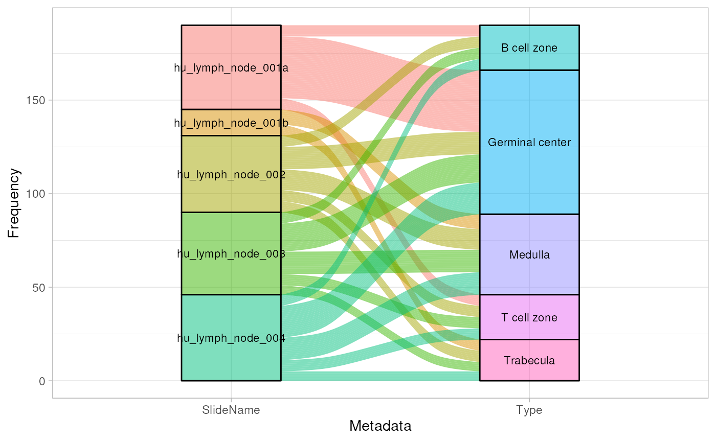
Gene level QC
Now we check on the gene level data. Using the
addPerROIQC function, we can add key statistics to the
colData of the object. For the purpose of this exercise, we
will set the argument rm_genes to TRUE, and keeping the
default settings of min_count = 5 and
sample_fraction = 0.9. We first calculate the expression
threshold using the logCPM data (to account for library size
variations), we then filter out the genes with low-expression values
that’s below the set threshold in more than 90% of the ROIs.
spe <- addPerROIQC(spe, rm_genes = TRUE)Looking at the object again, we can see that no genes were removed.
The count matrix of the genes that were removed will be stored in the
metadata of the object with prefix genes_rm,
alongside the calculated expression threshold
(lcpm_threshold).
dim(spe)## [1] 18676 190
metadata(spe) |> names()## [1] "NegProbes" "lcpm_threshold" "genes_rm_rawCount"
## [4] "genes_rm_logCPM"Using the plotGeneQC function, we can then assess the
logCPM expressions of the genes that were removed across the samples.
The function also plots the histogram distribution of the proportion of
non-expressed genes in all the ROIs (as a percentage). By default, the
top 9 genes are plotted here (ordered by the mean expression). Users can
customise the number of genes plotted using the parameter
top_n.
Moreover, users can order the samples (using parameter
ordannots) or color/shape the dots by specific annotation
to better compare and assess for specific biological or experimental
factors which are influencing how these genes were expressed across the
samples (e.g. gene may be highly expressed in particular tissue types or
under particular treatment conditions. These genes are to be access or
curated by domain experts to ascertain or determine if any of these
genes are of biological/experimental significance. This provides a
potential warning to whether the experiments have worked as per
intended.
plotGeneQC(spe, ordannots = "regions", col = regions, point_size = 2)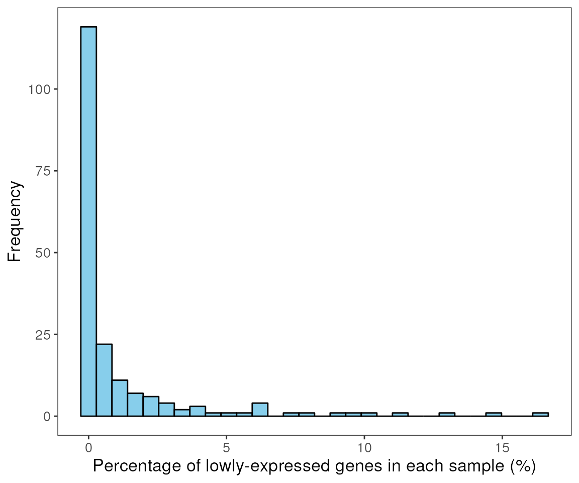
data("dkd_spe_subset")
dkd_spe_subset <- addPerROIQC(dkd_spe_subset)
plotGeneQC(dkd_spe_subset)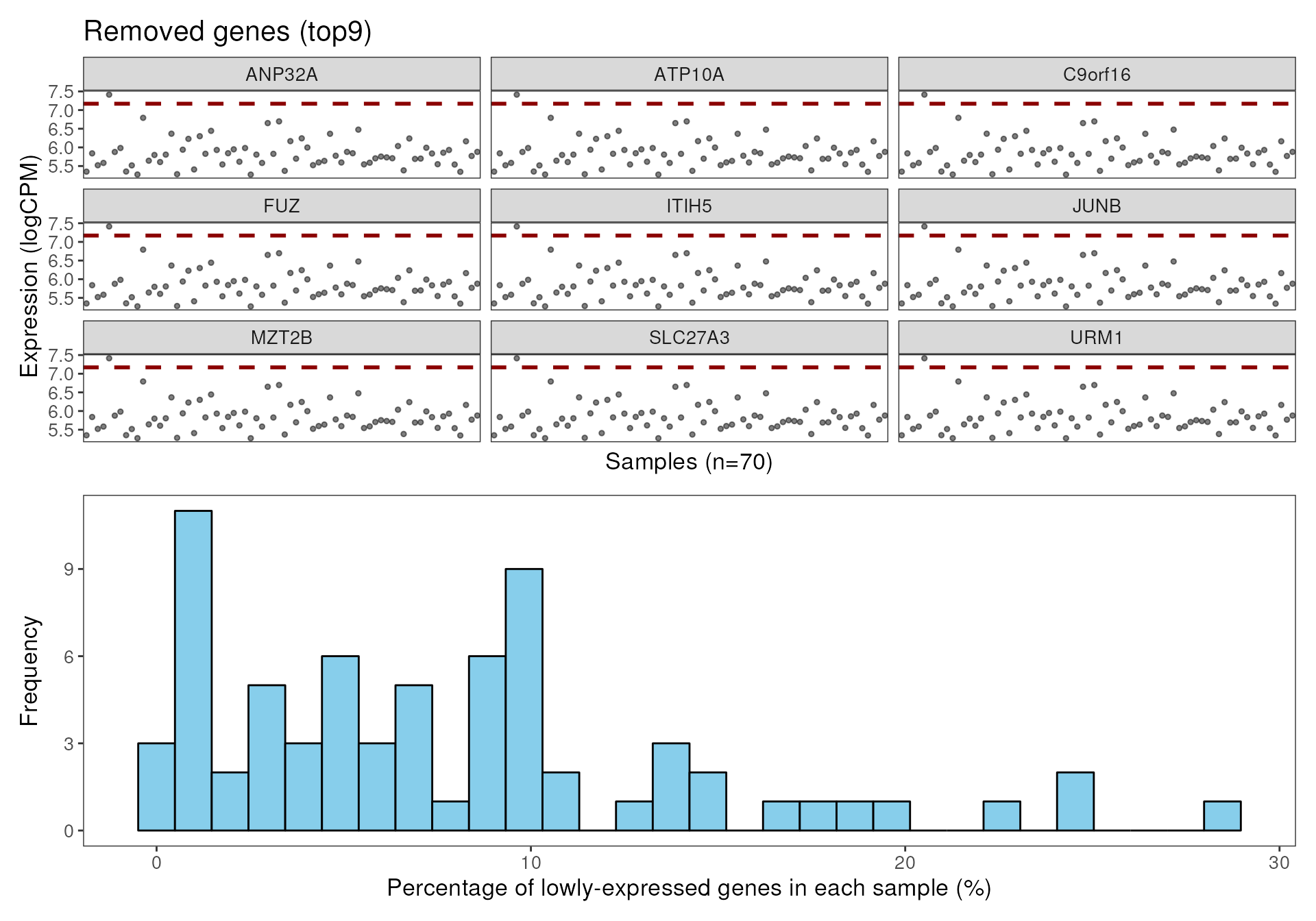
ROI level QC
After checking the genes, we can now look at the ROI level data.
Using the plotROIQC function, we can visualise QC
statistics at the ROI level. By default, the library size and cell count
(AOINucleiCount) will be computed.
In the ROI level QC, we first aim to identify (if any) ROI(s) that have relatively low library size and/or low cell count because they are considered as low quality samples due to insufficient sequencing depth or the lack of RNA in the selected region. Frequency histograms are also provided for both library size and nuclei count to assist with assessing any abnormal distributions of samples in the data.
In this case, we assess the distribution plot for library size against the nuclei count. Looking at the scatter plot, we expect the library sizes to be mostly positively correlated with the cell count (i.e. nuclei count). It is not unexpected for there to be some ROIs having relatively low library size and having a reasonable number of cells (nuclei count). In this dataset, we see this library size vs cell count relationship is relatively smooth with no aberrations observed (e.g. spikes at the lower ranges)
To remove/filter low quality samples, we define a filtering threshold near the lower end of the cell count range, in this case at 150 cells. We can also investigate if the bad quality tissue ROIs are all from one or two specific slide experiments by stratifying (color) the points based on their slide names.
plotROIQC(spe, x_threshold = 150, color = SlideName)
In this experiment, based on the above plot, the cell count threshold
of 150 looks to be a reasonable cutoff. As such we subset the spatial
experiment object based on the library size using this threshold in
colData. Here we remove 11 ROIs from the dataset.
qc <- colData(spe)$AOINucleiCount > 150
table(qc)## qc
## FALSE TRUE
## 11 179
spe <- spe[, qc]Note: The same workflow and logic can also be applied to the library size.
The function plotROIQC is looking at nuclei count and
library size of each ROI by default. User can change the x or y axis to
any other statics they want to QC by specifying the parameter
x_axis or y_axis. For example, we can plot the
area size again library size.
plotROIQC(spe, x_axis = "AOISurfaceArea", x_lab = "AreaSize", y_axis = "lib_size", y_lab = "Library size", col = SlideName)
Relative log expression distribution
After filtering, we will use function plotRLExpr to
visualise the relative log expression (RLE) of the data to identify any
technical variation that may be present in the dataset. We look at the
relative distance between the median of the RLE for each ROI (the dot in
the boxplot) to zero.
By default, we plot the RLE of the raw count, where we expect to see majority of the variation to be contributed by differences in library size.
plotRLExpr(spe)
By using assay = 2 to run RLE on the logCPM data, we can
see that most of the technical variations due to library size
differences are removed.
We can follow up by sorting the data based on the different sample
metadata annotations by specifying the ordannots parameter.
This can be visualised either with color or shape mapping parameters
(based on similar approaches for plotting in ggplot),
enabling quick assessment of the possible factors that’s contributing to
the observed technical variation(s).
In this case, we stratify by slideName using different colors which clearly show substantial variations between the slides as well as to a lesser extent within each slide.
plotRLExpr(spe, ordannots = "SlideName", assay = 2, color = SlideName)
We can also try out other factors (e.g. Tissue Type) to see how they influence the expression.
plotRLExpr(spe, ordannots = "Type", assay = 2, color = Type)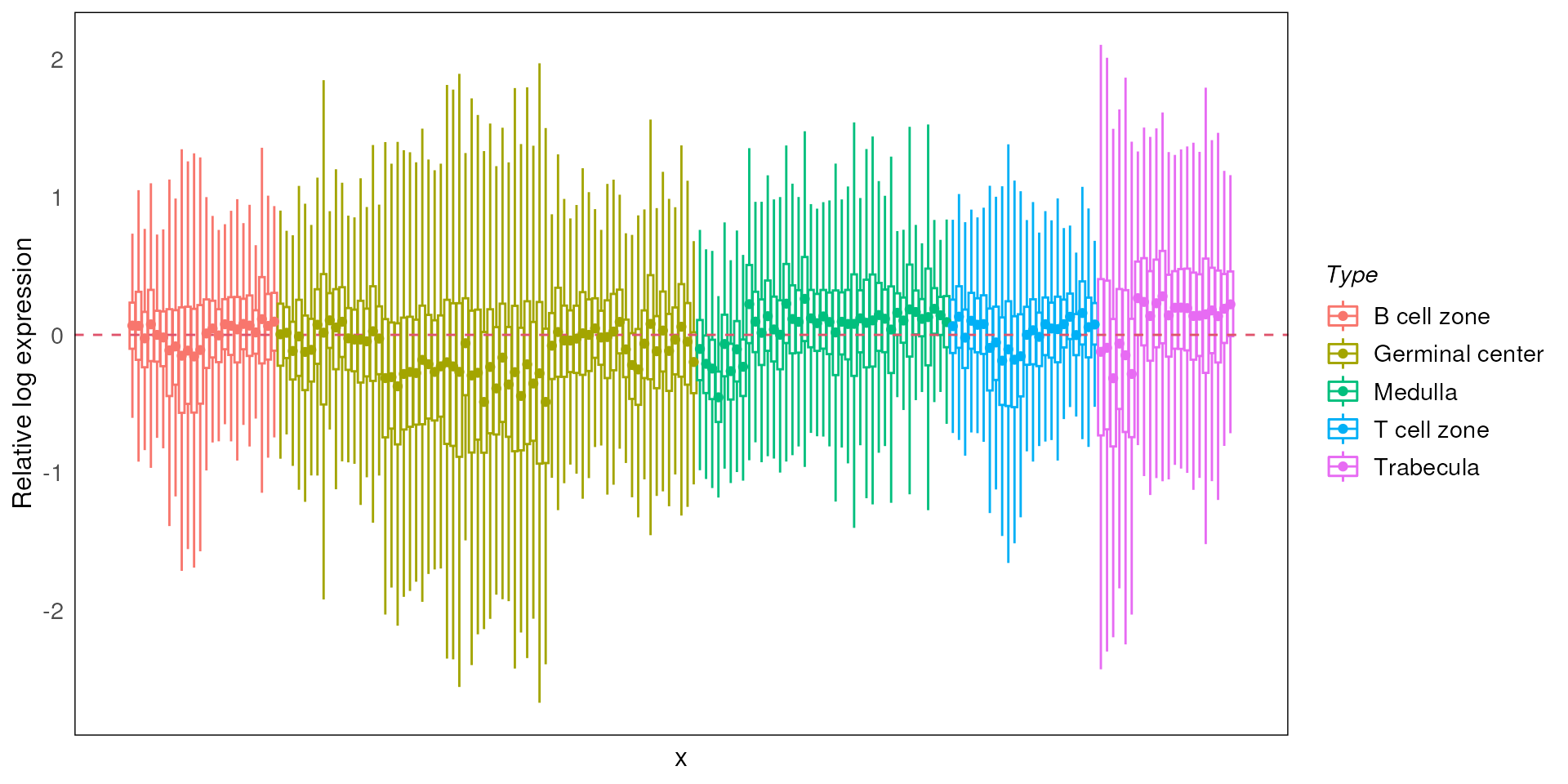
Dimension reduction
PCA
We can also look at the data by breaking it down into the lower dimensions.
Using the drawPCA function, we can perform principal
component analysis (PCA) on the data. The PCA can help visualise any
potential systemic variations (both biological and technical) in the
data and to identify the main factors contributing to the
variations.
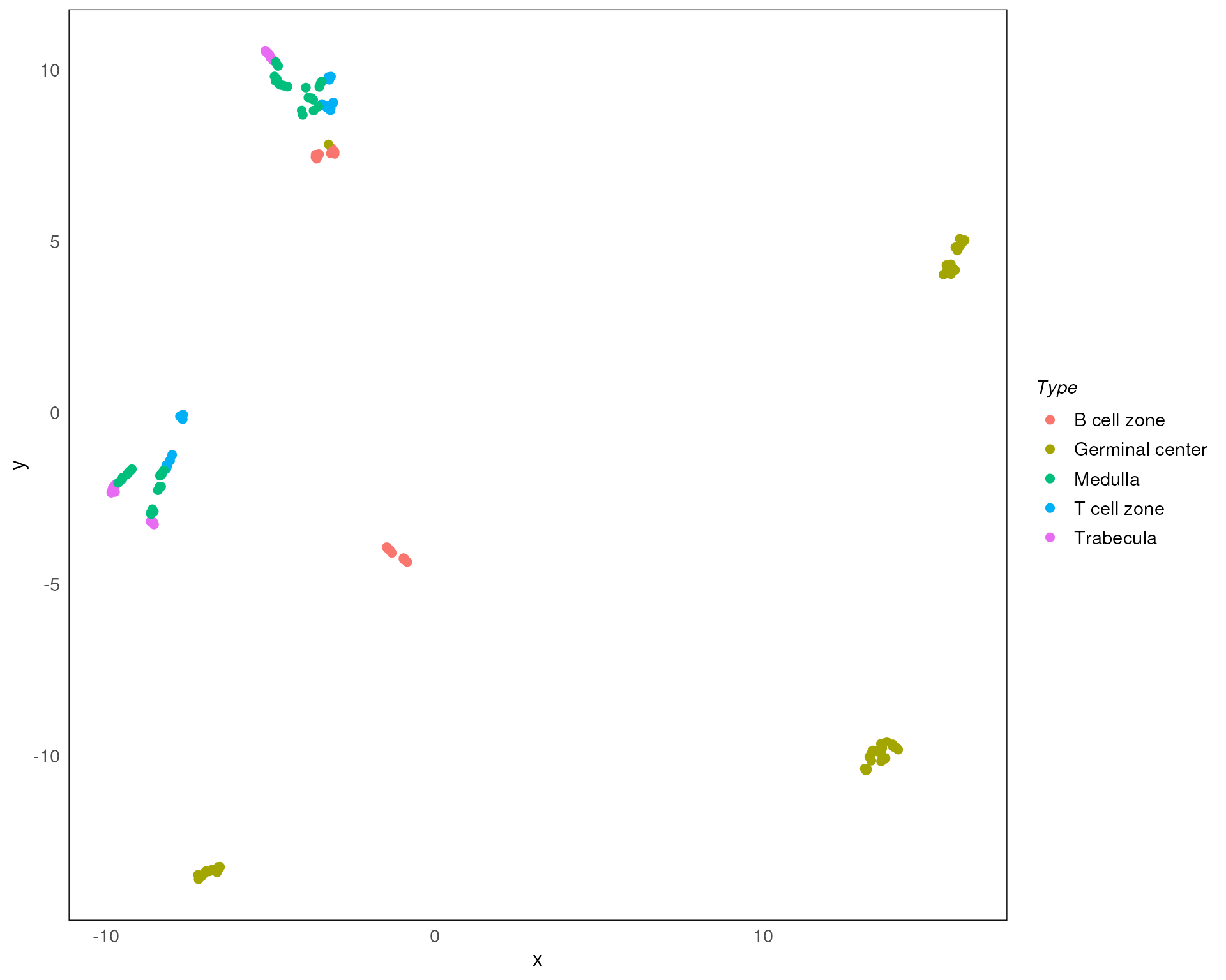
Here we stratify the points based on sub-tissues types (Type using color). It is clear that sub-tissue types can be explained on PC1. But we can also observe a separation between the same sub-tissue types.
drawPCA(spe, assay = 2, color = Type)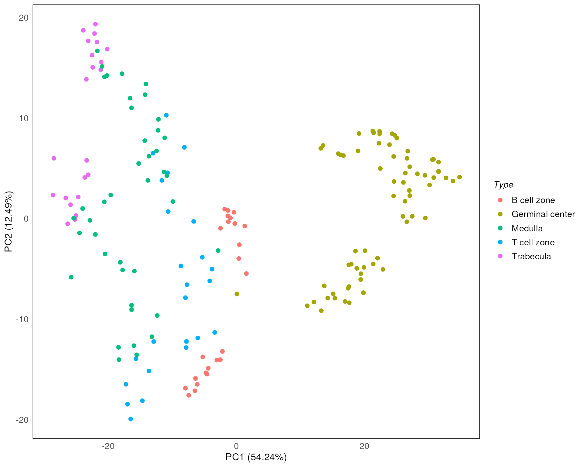
Since the drawPCA function would calculate PCA every
time, the outputed PCA plot might be different (flipped x or y axis). To
make the result consistent, we can pre-compute the PCA using
scater::runPCA, then infer the PCA results by using the
parameter precomputed in the drawPCA
function.
set.seed(100)
spe <- scater::runPCA(spe)
pca_results <- reducedDim(spe, "PCA")
drawPCA(spe, precomputed = pca_results, col = Type)
Here we stratify the points based on slide annotations. We can see that the slide annotation explain the separation we observed above, indicating the batch effect introduced by the slide difference in the data.
drawPCA(spe, precomputed = pca_results, col = SlideName)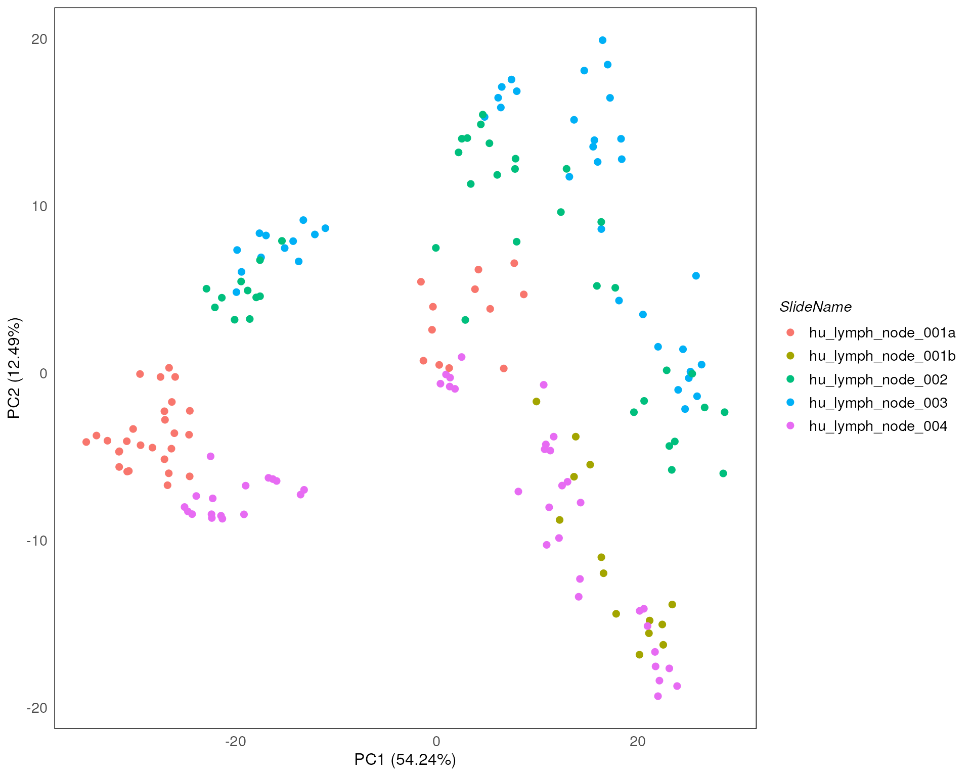
The standR package also provide other functions to
visualise the PCA, including the PCA scree plot, pair-dimension PCA plot
and PCA bi-plot.
plotScreePCA(spe, precomputed = pca_results)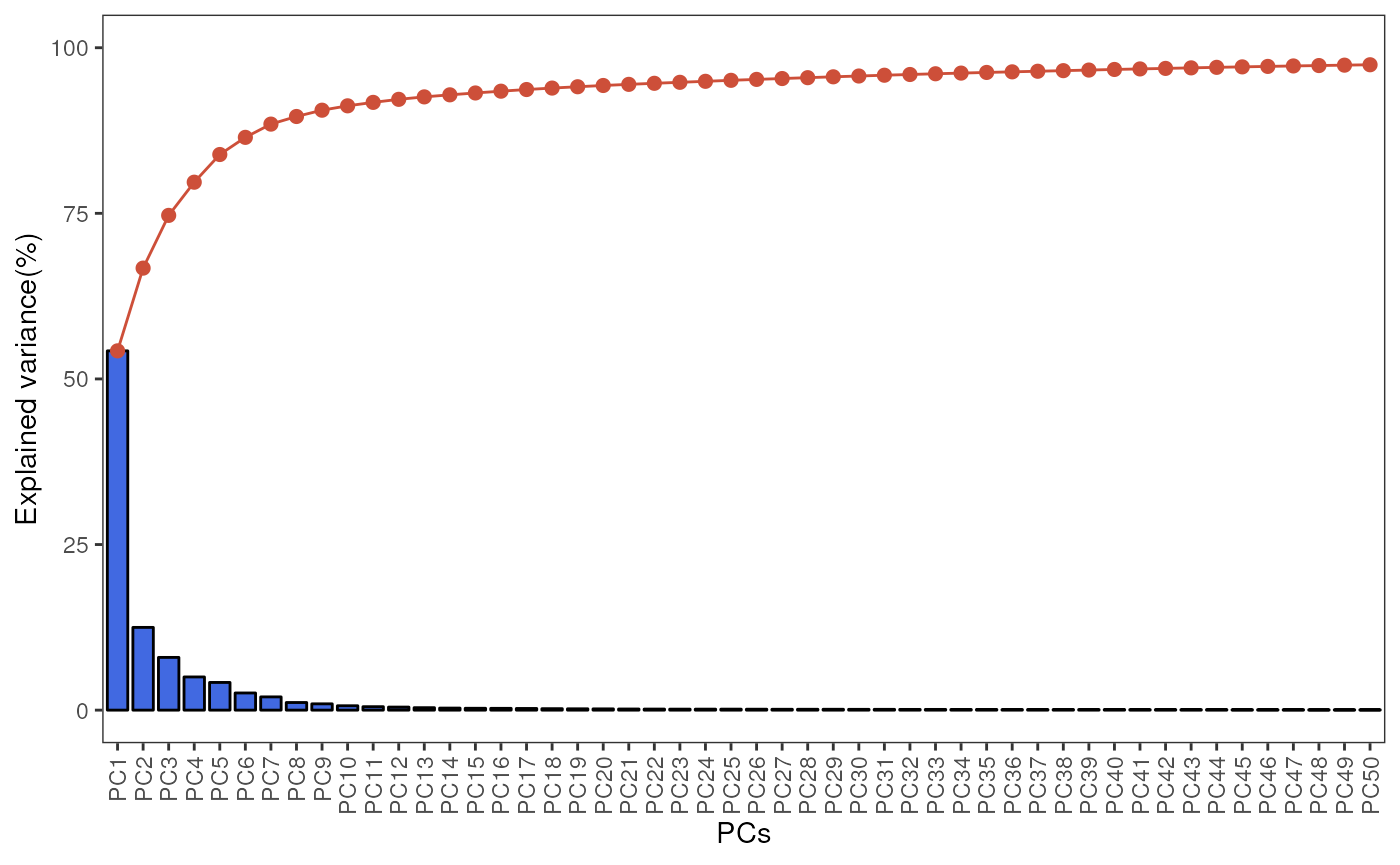
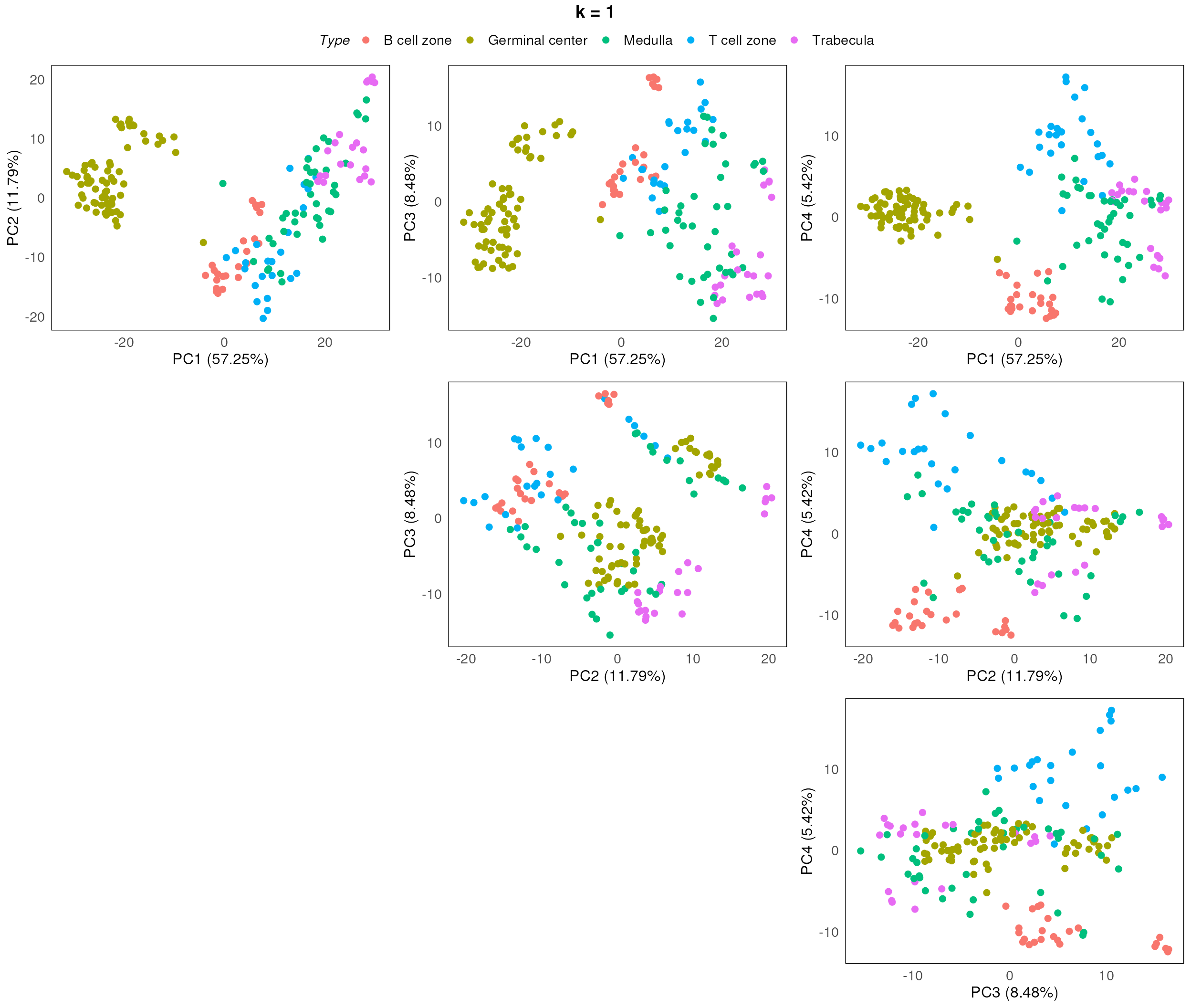
plotPairPCA(spe, col = Type, precomputed = pca_results, n_dimension = 4)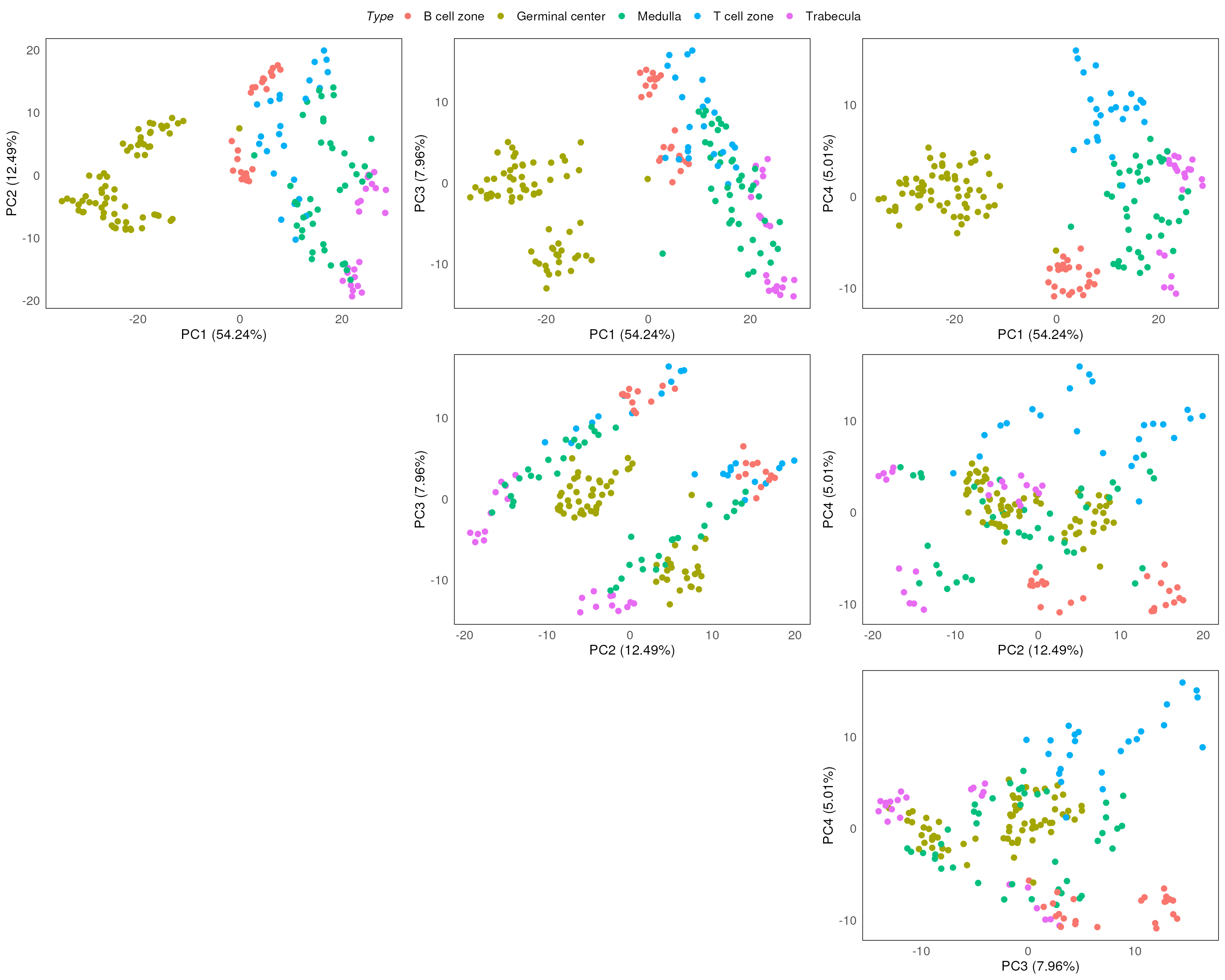
plotPairPCA(spe, col = SlideName, precomputed = pca_results, n_dimension = 4)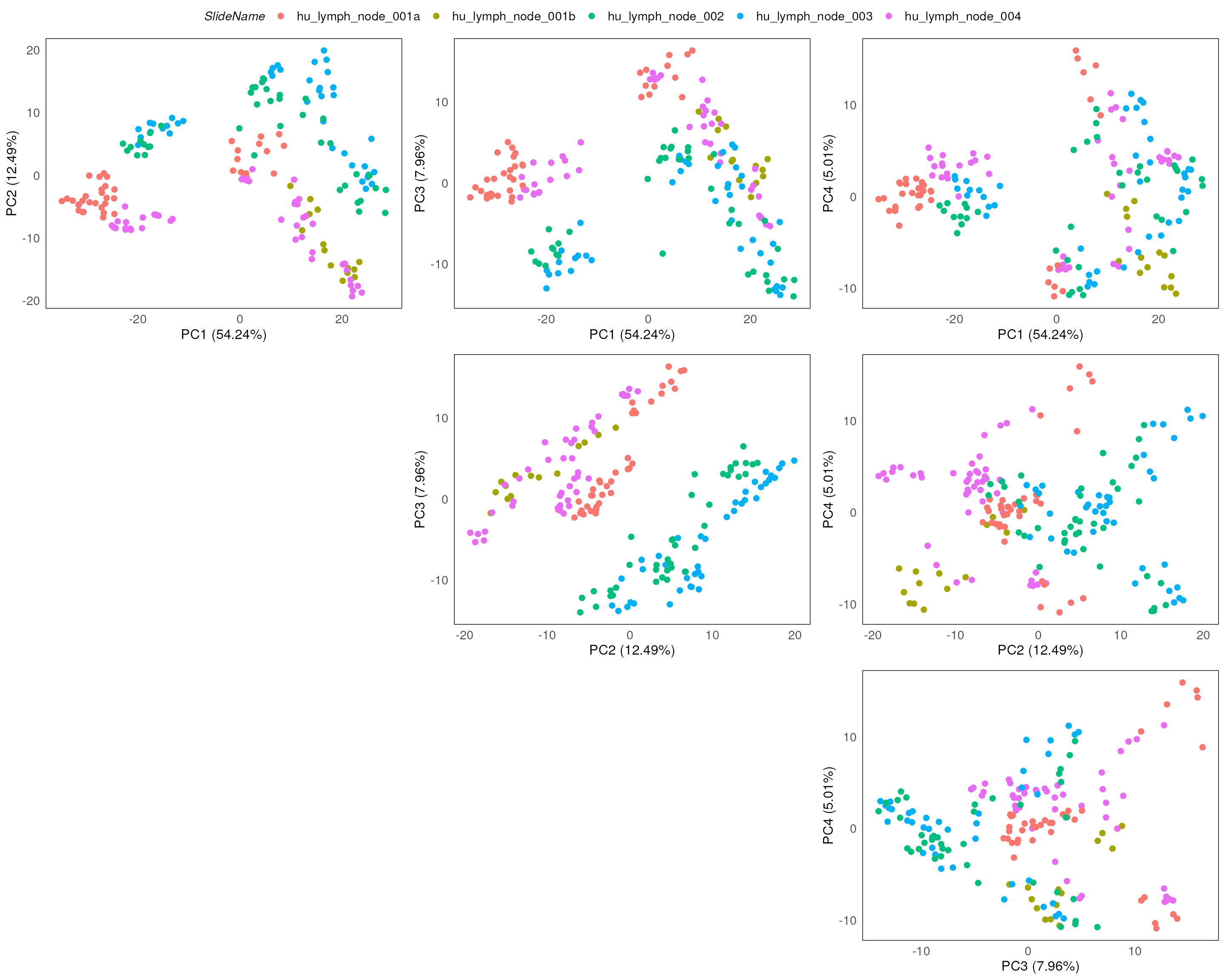
plotPCAbiplot(spe, n_loadings = 10, precomputed = pca_results, col = Type)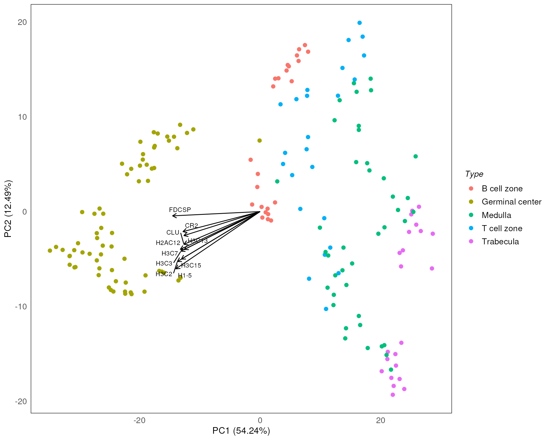
MDS
Another way to visualise the data is to look at the Multidimensional
scaling (MDS) plots. The function plotMDS provides the
means to visualise the data in this way.
standR::plotMDS(spe, assay = 2, color = Type)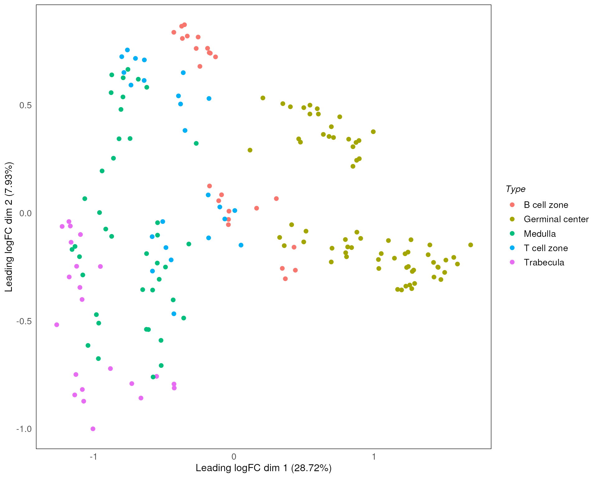
UMAP
Furthermore, since we’re using SpatialExperiment as our
infrastructure, we are able to incorporate or apply other widely used
packages such as scater, which is commonly used in single
cell data and spatial 10x genomics visium data analyses. We also provide
the function plotDR to visualise any dimension reduction
results generated using scater::run*, such as UMAP, TSNE
and NMF. This can be done by simply specifying the dimred
parameter.
Here we plot the UMAP of our data. Similar variations can be generated for other approaches like PCA and MDS as discussed earlier.
plotDR(spe, dimred = "UMAP", col = SlideName)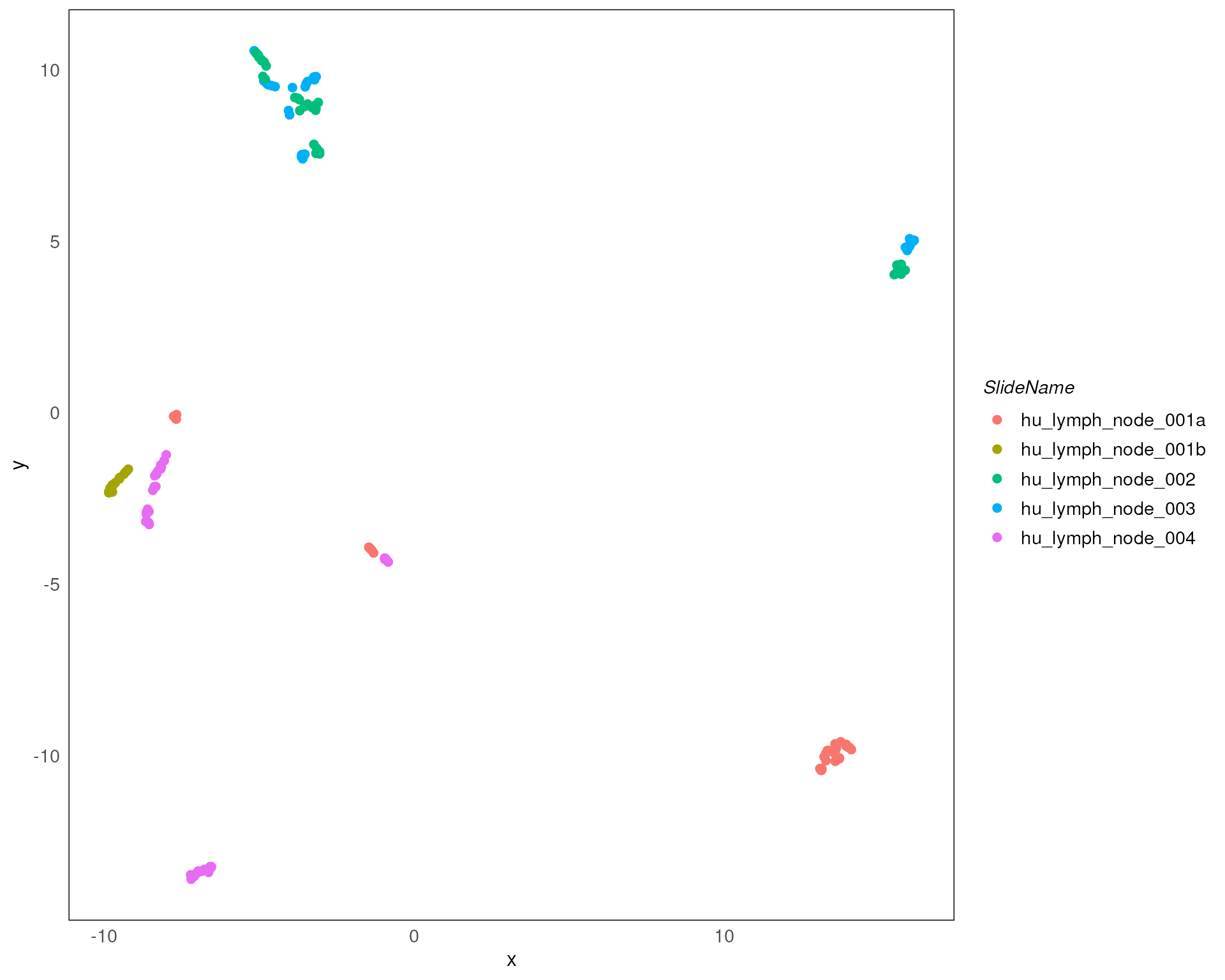
Normalization
If there are observed technical variations identified in the earlier QC steps, before proceeding with any analysis of the data, it is necessary to appropriately perform normalization of the data to rectify/minimise the identified variation.
The standR package offers normalization options
including TMM, RPKM, TPM, CPM, upperquartile and sizefactor. Among
these, RPKM and TPM require gene length information (add
genelength column to the rowData of the
object). For TMM, upperquartile and sizefactor, their normalized factor
will be stored in their metadata.
Here we used TMM to normalize the data.
spe_tmm <- geomxNorm(spe, method = "TMM")To assess how well the normalization was able to remove unwanted variataions, we make use of RLE and PCA plot in conjunction with the factors of interest.
In this case, from the resulting RLE plot, most of the medians of RLE are close to zero, suggesting that most of the technical variations have been removed.
plotRLExpr(spe_tmm, assay = 2, color = SlideName) + ggtitle("TMM")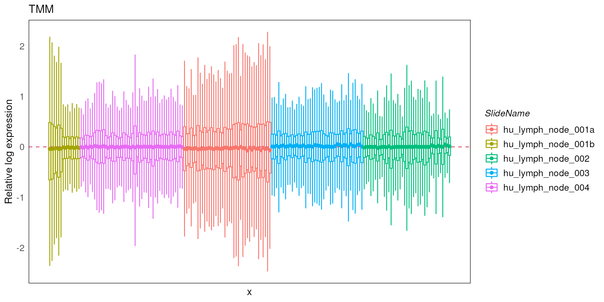
However, from the PCA plots, the batch effect due to the different slides are still being observed, confounding the known biology of interest (which is between disease and normal).
set.seed(100)
spe_tmm <- scater::runPCA(spe_tmm)
pca_results_tmm <- reducedDim(spe_tmm, "PCA")
plotPairPCA(spe_tmm, precomputed = pca_results_tmm, color = Type)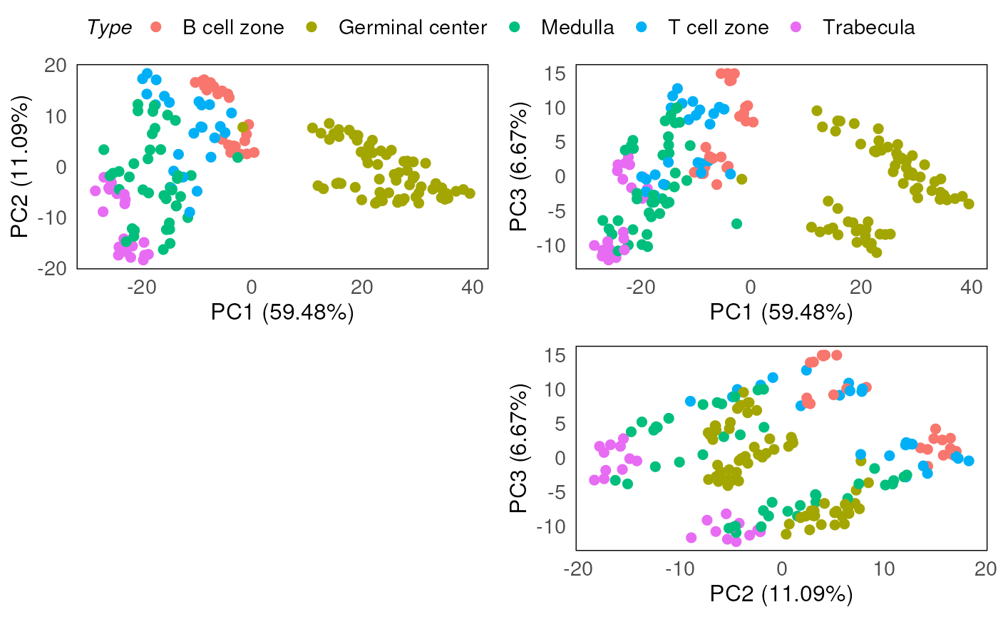
plotPairPCA(spe_tmm, precomputed = pca_results_tmm, color = SlideName)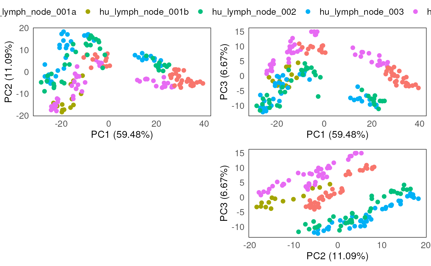
Batch correction
In the Nanostring’s GeoMx DSP protocol, each slide is typically only able to fit a handful of tissue segments (Tissue microarrays/FFPE cores), it is common that DSP data are confounded by the batch effect introduced by the different slides. In order to establish appropriate comparisons between the ROIs in the downstream analyses, it is necessary to remove this batch effect from the data.
In the standR package, we provide two approaches for
removing batch effects (RUV4 and Limma), more methods (e.g. RUVg) are
included in the development version.
Correction method : Remove Unwanted Variation 4 (RUV4)
Remove Unwanted Variation 4 (RUV4) is a method developed by Terry Speed and Johann Gagnon-Bartsch to use negative control genes to remove unwanted variations, see the published paper here.
To run batch correction using RUV4, a list of “negative control genes (NCGs)” will be required.
standR provides a function findNCGs which
identify the NCGs from the data. In this case, since the batch effect is
mostly due to slide effects, we aim to identify NCGs across all the
slides. As such, the batch_name parameter was set to
“SlideName”, and the top 300 least variable genes (ranked by coefficient
of variation) across different slides were identified as NCGs. These are
stored in the object as “NCGs”.
## [1] "NegProbes"         "lcpm_threshold"    "genes_rm_rawCount"
## [4] "genes_rm_logCPM" "NCGs"Now we run RUV4 using the function geomxBatchCorrection.
By default this function will use RUV4 to normalize the
data.
For RUV4 correction, the function requires 3 addition parameters other than the input object:
-
factors: the factor of interest, i.e. the biological variation to keep; -
NCGs: the list of negative control genes detected using the functionfindNCGs; -
k: the number of unwanted factors to use. Based on RUV’s documentation, it is suggest to use the smallest k possible where the observed technical variation is no longer observed.
Choosing the optimal k is one of the most important task when performing batch correction using RUV. The best way to do so is to test out each k and assess the corresponding diagnostic plot (e.g. PCA). The optimal k would be the smallest value that produces a separation of the main biology of interest of the experiment on a PCA plot.
So here we run through the paired PCA plots for k between 1 and 5.
In this case, we create a combined factor of interest Type
(sub-tissue type annotation) in the object. This factor will be
specified in the factors parameter of the function.
for(i in seq(5)){
  spe_ruv <- geomxBatchCorrection(spe, factors = "Type",
                   NCGs = metadata(spe)$NCGs, k = i)

  print(plotPairPCA(spe_ruv, assay = 2, n_dimension = 4, color = Type, title = paste0("k = ", i)))

}
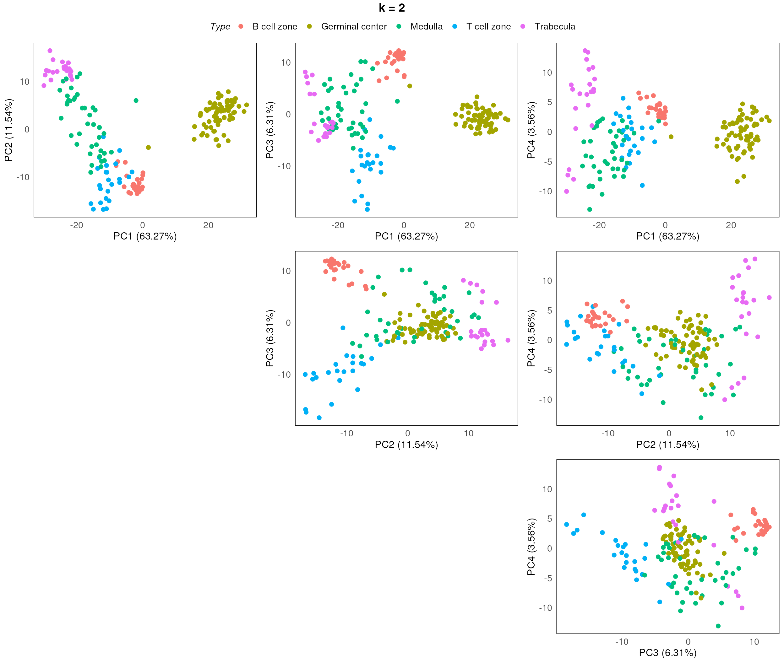
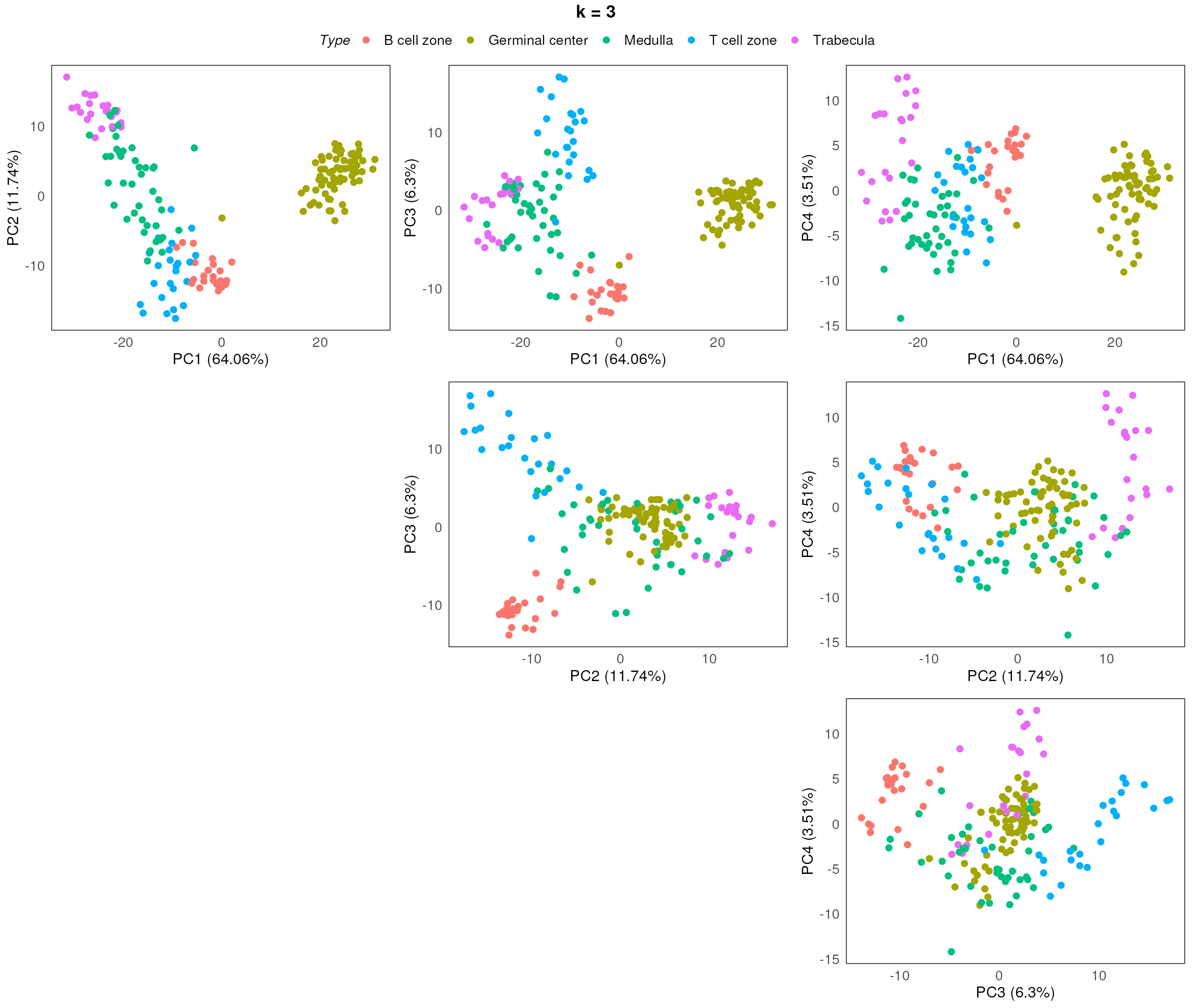
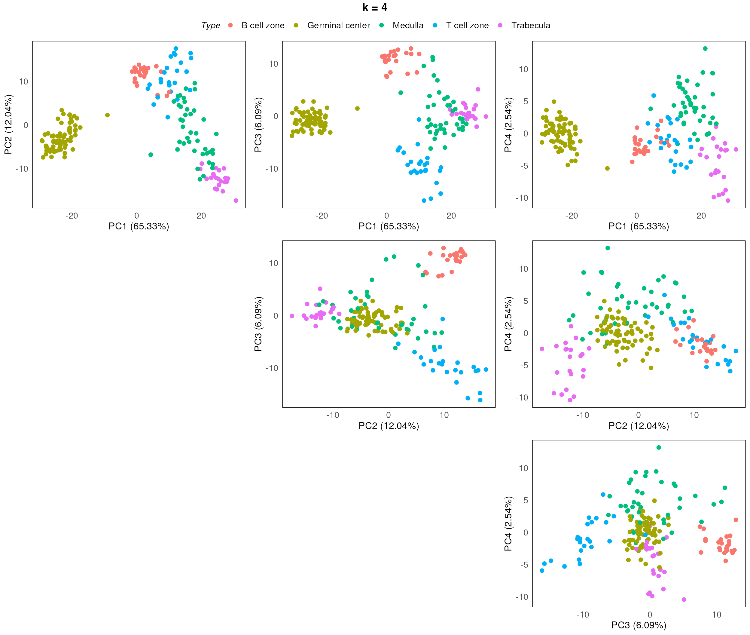
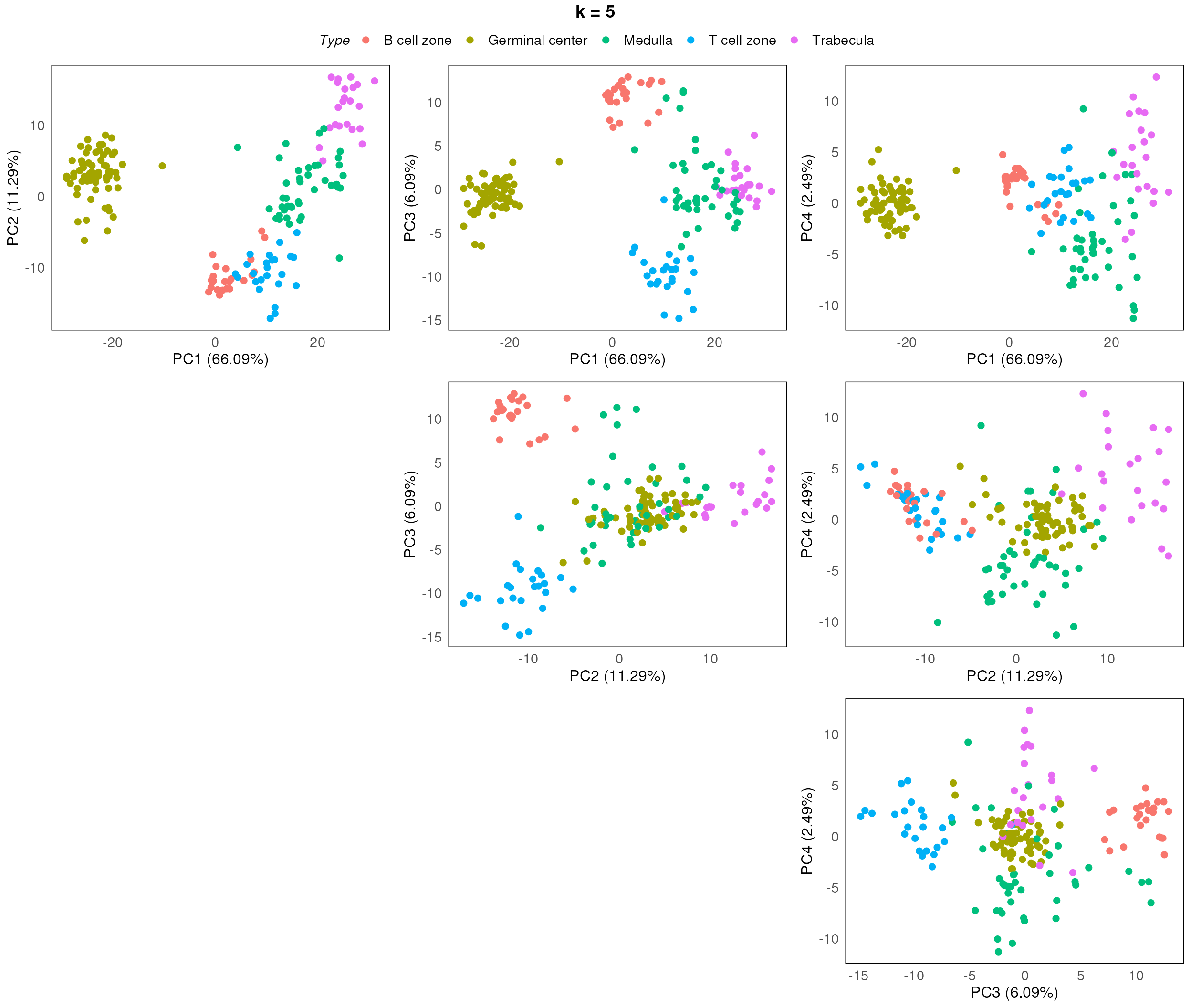
After assessing the generated PCA plots, we choose k = 2 to be our best k. From the resulting PCA, we can see that the disease status are reasonable separated within each region type.
spe_ruv <- geomxBatchCorrection(spe, factors = "Type",
                   NCGs = metadata(spe)$NCGs, k = 2)

set.seed(100)

spe_ruv <- scater::runPCA(spe_ruv)

pca_results_ruv <- reducedDim(spe_ruv, "PCA")

plotPairPCA(spe_ruv, precomputed = pca_results_ruv, color = Type, title = "RUV4, k = 2", n_dimension = 4)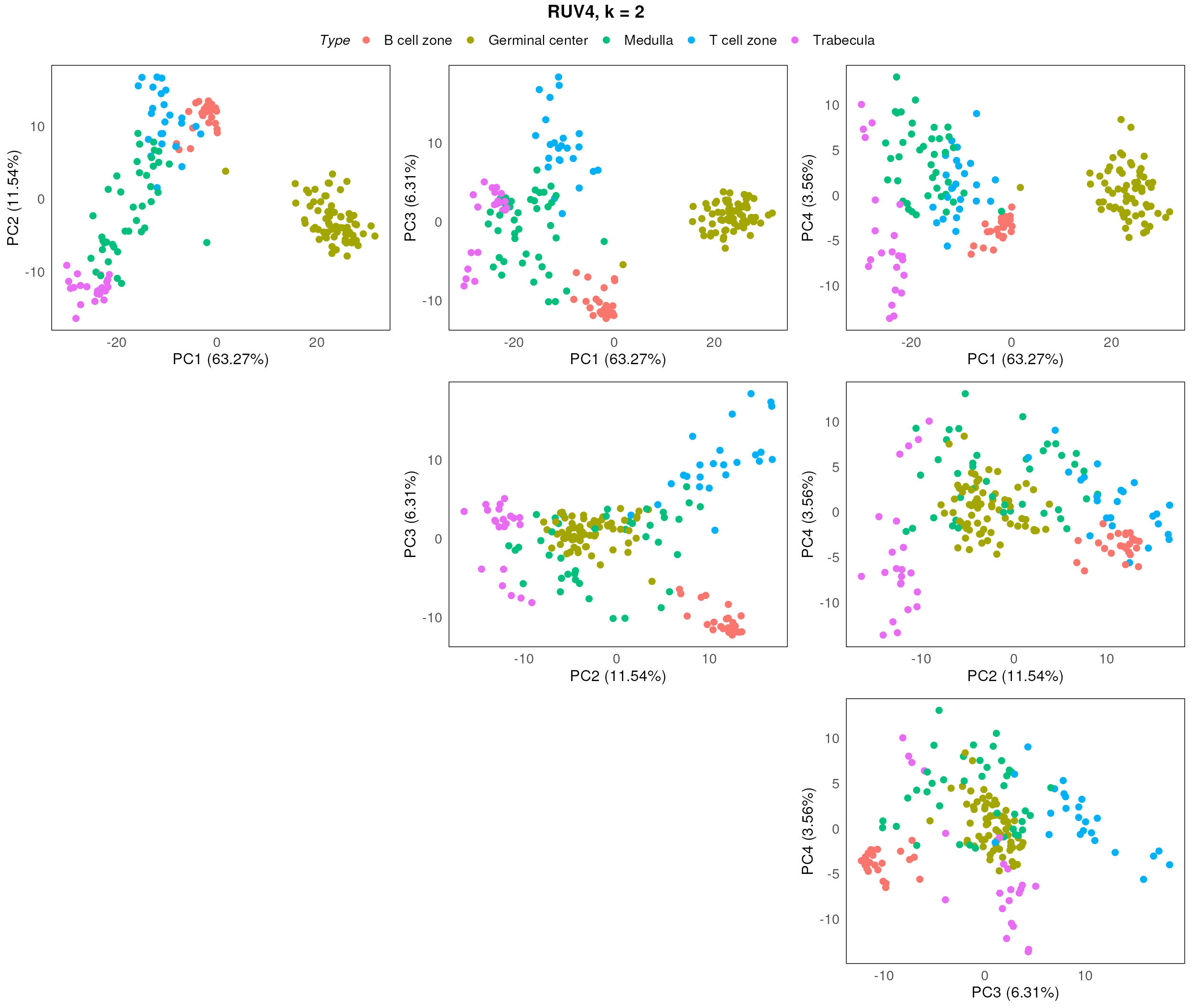
plotPairPCA(spe_ruv, precomputed = pca_results_ruv, color = SlideName, title = "RUV4, k = 2", n_dimension = 4)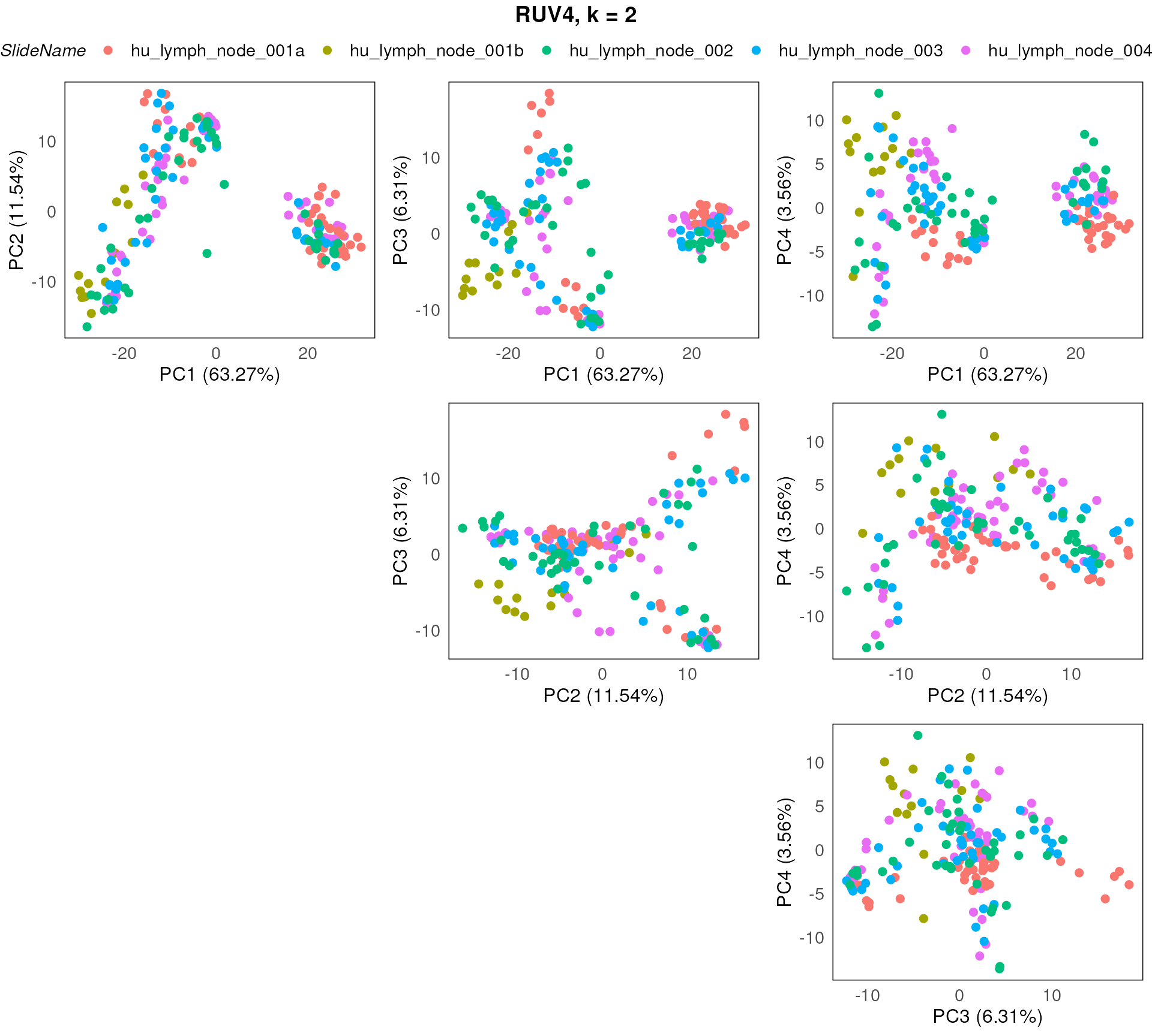
Correction method: limma
The other available batch correction method is based on the
removeBatchEffect function from the bioconductor package
limma, more details of the method can see paper here.
To use the limma batch correction, set the parameter
method to “Limma”, which uses the remove batch correction
method from limma package. In this mode, the function
requires 2 addition parameters other than the input object:
-
batch: a vector indicating the batch information for all samples; -
design: a design matrix generated frommodel.matrix, in the design matrix, all biologically-relevant factors should be included.
In this case, the batch effect is based on the slides (SlideName) and factors of interest includes “disease_status” and “regions”.
spe_lrb <- geomxBatchCorrection(spe,
                       batch = colData(spe)$SlideName, method = "Limma",
                       design = model.matrix(~Type, data = colData(spe)))
Once again, we use the respective QC plots like PCA to inspect and assess the effectiveness of the applied batch correction process.
In this instance, using limma::removeBatchEffect
approach seems to be working well.
plotPairPCA(spe_lrb, assay = 2, color = Type, title = "Limma removeBatch")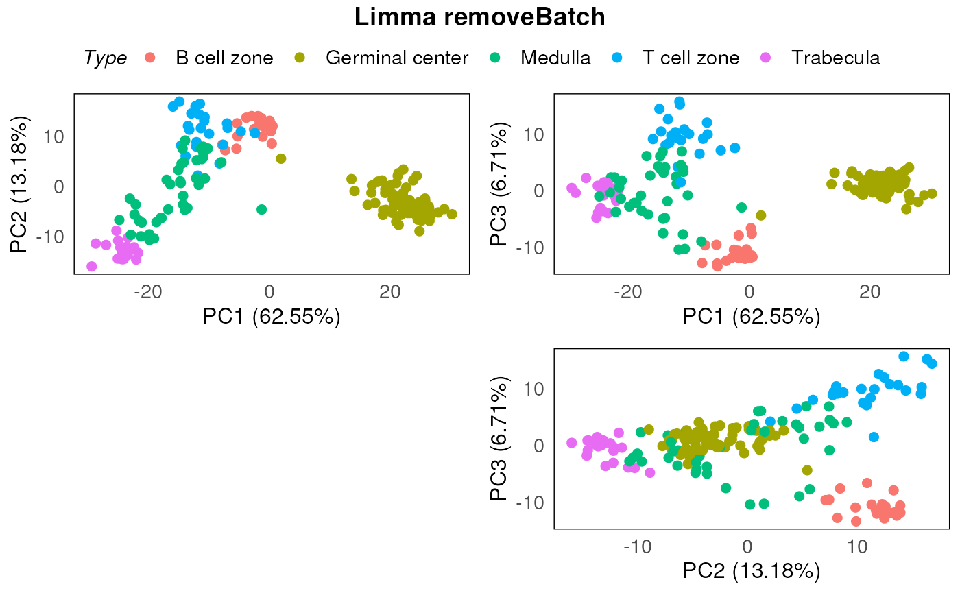
plotPairPCA(spe_lrb, assay = 2, color = SlideName, title = "Limma removeBatch")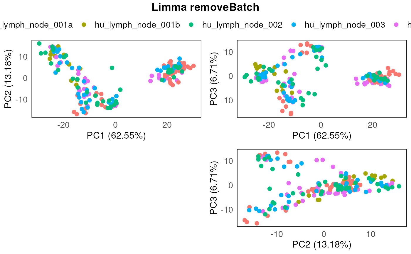
Evaluation
Summary statistics
The typical approach to interrogating the effectiveness of batch correction process on the data uses dimension reduction plots like PCAs. Here we further suggest the use of summarized statistics to assess the effectiveness of batch correction. The 6 summarized statistics tested in this package includes:
- Adjusted rand index.
- Jaccard similarity coefficient.
- Silhouette coefficient.
- Chi-squared coefficient.
- Mirkin distance.
- Overlap Coefficient
This assessment can be conducted by using the
plotClusterEvalStats function provided in
standR.
Here we present the output for the summarised statistics for the two normalization methods in this workshop (i.e. RUV4 and Limma ) as well as the uncorrected data. Scores for each method will be presented as a barplot scores of the six summarized statistics (as above) under two sections (biology and batch). As a general rule, for the biology of interest defined in the batch correction process, a higher score is considered a good outcome. On the other hand, for the batch, a smaller score will be the preferred outcome.
We can see from the results that when it comes to stratifying based
on biological factors (sub-tissue types) or quantifying the amount of
clustering due to batch effects for this dataset, RUV4 and
limma perform similarly.
spe_list <- list(spe, spe_ruv, spe_lrb)

plotClusterEvalStats(spe_list = spe_list,
                     bio_feature_name = "Type",
                     batch_feature_name = "SlideName",
                     data_names = c("Raw","RUV4","Limma"))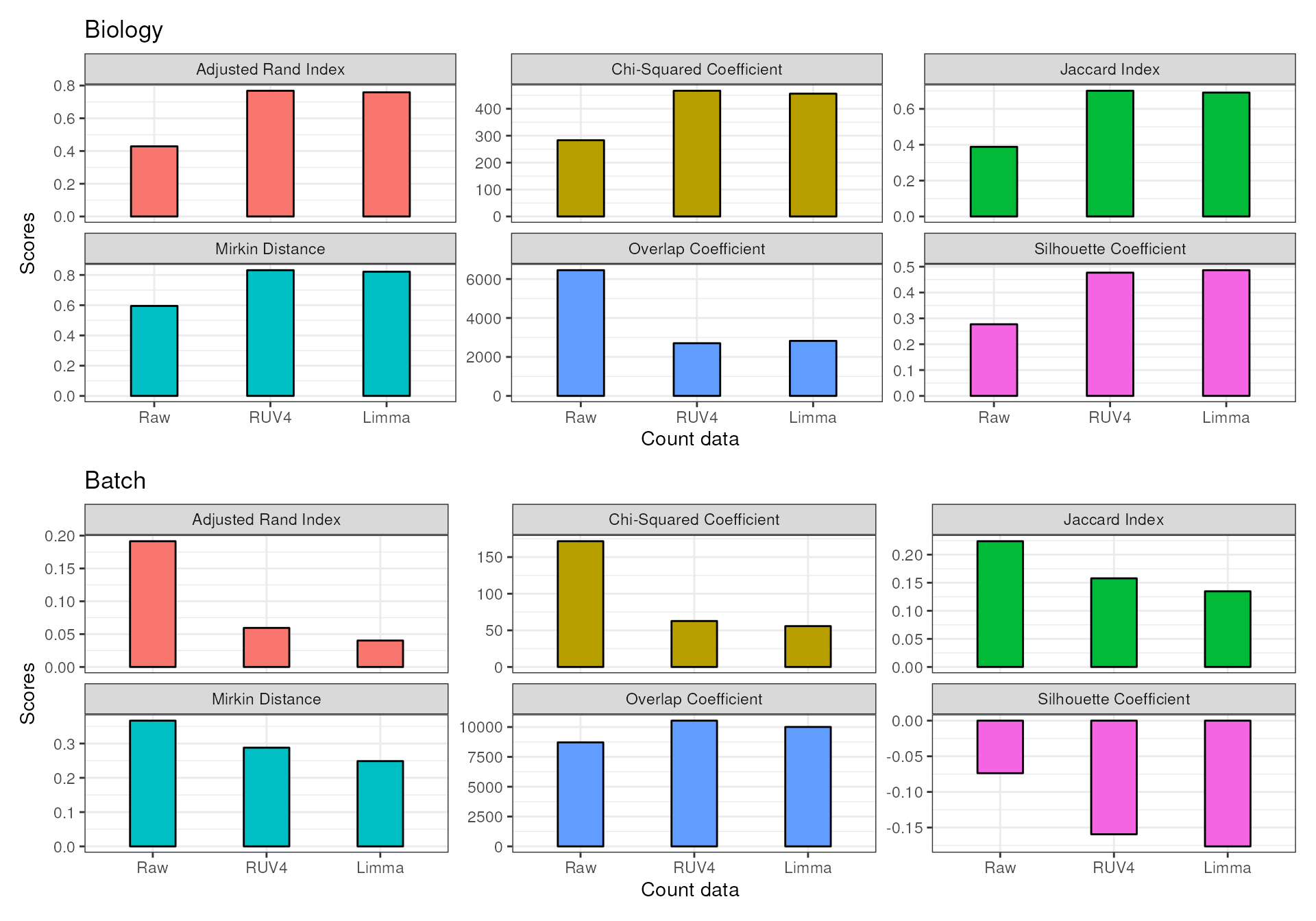
RLE plots
In addition, we can visualize the outcomes using RLE plots of normalized count to determine which batch correction performs better for this dataset.
Plotting both the RLEs for RUV4-corrected and limma-corrected data, we can see they perform similarly. Therefore, for the downstream differential expression analysis, we can use either RUV4 or limma as the batch correction method for this specific dataset.
plotRLExpr(spe_ruv, assay = 2, color = SlideName) + ggtitle("RUV4")
plotRLExpr(spe_lrb, assay = 2, color = SlideName) + ggtitle("Limma removeBatch")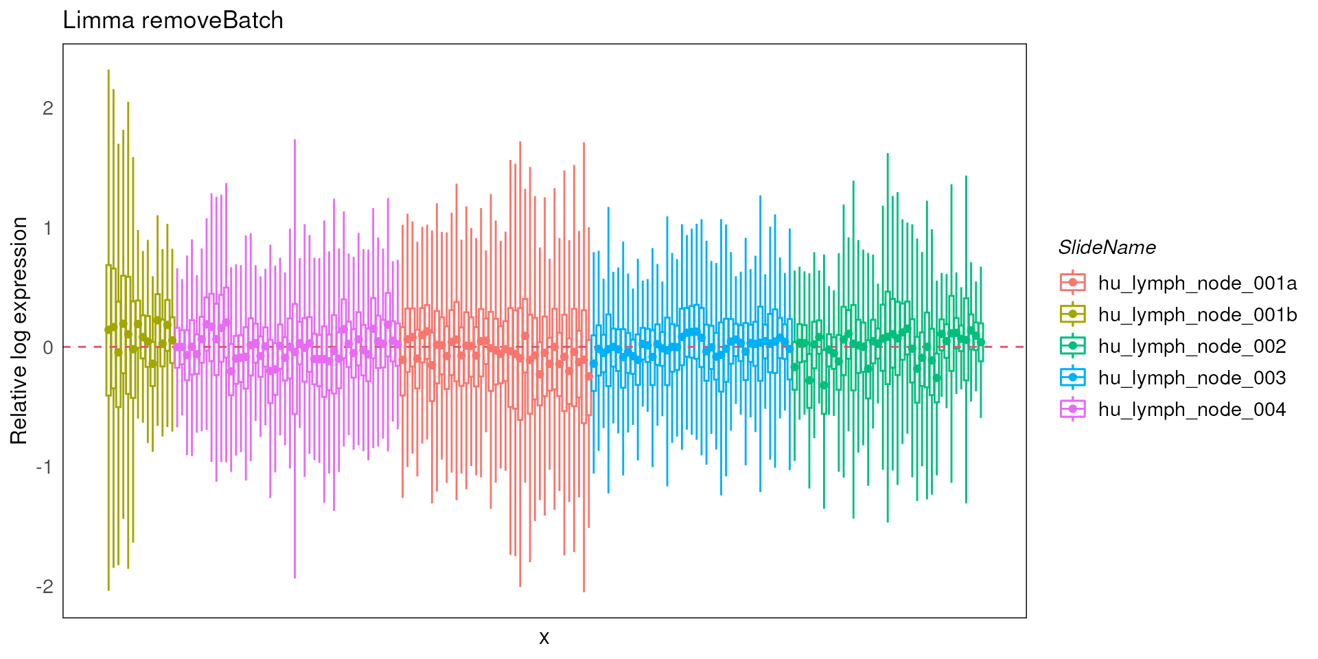
Differential expression analysis with limma-voom pipeline
For the downstream analyses such as differential expression analyses, standR does not provide specific functions.
Instead, we recommend incorporating the workflow with well
established pipelines, such as edgeR,
limma-voom or DESeq2. These pipelines uses
linear modelling which borrow information from all genes, making it more
appropriate for complex dataset with various experimental factors. A
simple T-test is definitely not recommended for performing DE analysis
of GeoMx DSP data.
In this workshop, we’ll demonstrate the DE analysis using the
limma-voom pipeline.
We’ve shown in previous sections that for this dataset, using RUV4
with k = 2 is the appropriate batch correction approach and
is able to remove the batch effect and other undesired technical
variations. However, normalised count are not intended to be
used in linear modelling. For linear modelling, it is better to
include the weight matrix generated from the function
geomxBatchCorrection as covariates. The weight matrix can
be found in the colData.
## DataFrame with 6 rows and 2 columns
##                         ruv_W1      ruv_W2
##                      <numeric>   <numeric>
## 32 | 001 | Full ROI -0.0910127 -0.01287756
## 32 | 002 | Full ROI -0.1207288  0.01499168
## 32 | 003 | Full ROI -0.0854322 -0.01447091
## 32 | 004 | Full ROI -0.1270450  0.02428209
## 32 | 005 | Full ROI -0.0939752  0.00820969
## 32 | 006 | Full ROI -0.0916822 -0.00382878
Establishing a design matrix and contrast
To incorporate the limma-voom pipeline, we recommend
using the DGElist infrastructure. Our
SpatialExperiment can be easily transformed into a
DGElist object by using the SE2DGEList
function from the edgeR package. For more information about
DGEList see ?DGEList.
library(edgeR)
library(limma)

dge <- SE2DGEList(spe_ruv)
In our analysis, it is of interest to see which genes are
differential expressed in different tissue regions of the samples, a
design matrix is therefore set up with sub-tissue types information. We
added the W matrices resulted from the RUV4 to the model
matrix as covariates to use batch corrected data. For more information
about how to desgin your design matrix, see the limma
user guide or this F1000 paper
of design matrix.
design <- model.matrix(~0 + Type + ruv_W1 + ruv_W2 , data = colData(spe_ruv))

colnames(design)
## [1] "TypeB cell zone" "TypeGerminal center" "TypeMedulla"
## [4] "TypeT cell zone" "TypeTrabecula" "ruv_W1"
## [7] "ruv_W2"To simplify the factor name, here we edit the column name of the design matrix by removing the prefix “Type” and replacing spaces with underscores.
colnames(design) <- gsub("^Type","",colnames(design))
colnames(design) <- gsub(" ","_",colnames(design))

colnames(design)
## [1] "B_cell_zone" "Germinal_center" "Medulla" "T_cell_zone"
## [5] "Trabecula" "ruv_W1" "ruv_W2"In this analysis, we will be looking at comparison between B cell
zone and T cell zone. The contrast for pairwise comparisons between
different groups are set up in using the makeContrasts
function from Limma.
contr.matrix <- makeContrasts(
   BvT = B_cell_zone - T_cell_zone,
   levels = colnames(design))
It is recommended to filter out genes with low coverage in the
dataset to allow a more accurate mean-variance relationship and reduce
the number of statistical tests. Here we use the
filterByExpr function from the edgeR package
to filter genes based on the model matrix, keeping as many genes as
possible with reasonable counts.
keep <- filterByExpr(dge, design)Here we can see that 1 gene is filtered.
table(keep)## keep
## FALSE TRUE
## 1 18675
rownames(dge)[!keep]## [1] "ST6GALNAC1"
dge_all <- dge[keep, ]BCV check
dge_all <- estimateDisp(dge_all, design = design, robust = TRUE)Biological CV (BCV) is the coefficient of variation with which the (unknown) true abundance of the gene varies between replicate RNA samples. For more detail about dispersion and BCV calculation, see the edgeR user guide.
There are three main features we need to look at in the BCV plot of a GeoMx dataset:
Dispersion trend: the dispersion trend is expected to become flat in genes with larger count.
Common trend: should be relatively small. In RNA-seq data, a common trend between 0.2 and 0.4 is expected in human sample, 0.05 - 0.2 is expected in mice and cell lines. In the GeoMx experiments, since we’re sampling segments from human tissues, we expected it to be smaller than the RNA-seq human samples.
Genes with low count: be very careful if you see a strips of genes show up with high BCV and low count.
genes with high BCV: should also be careful about the genes with high BCV as well, very likely they will be identified as DE genes and driving the variation we saw in the PCA plots. So it is alway good practice to check the high BCV genes, consulting with the biologists to make sure that they expected to be highly variable.
plotBCV(dge_all, legend.position = "topleft", ylim = c(0, 1.3))
bcv_df <- data.frame(
  'BCV' = sqrt(dge_all$tagwise.dispersion),
  'AveLogCPM' = dge_all$AveLogCPM,
  'gene_id' = rownames(dge_all)
)

highbcv <- bcv_df$BCV > 0.8
highbcv_df <- bcv_df[highbcv, ]
points(highbcv_df$AveLogCPM, highbcv_df$BCV, col = "red")
text(highbcv_df$AveLogCPM, highbcv_df$BCV, labels = highbcv_df$gene_id, pos = 4)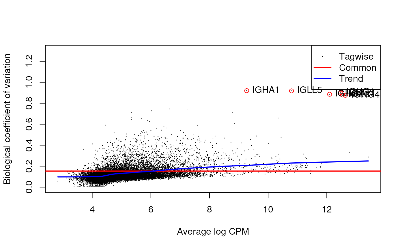
Differential expression
In the limma-voom pipeline, linear modelling is carried
out on the log-CPM values by using the voom,
lmFit, contrasts.fit and eBayes
functions. In specific cases where users like to take more
considerations of the log fold changes in the statistical analysis, the
treat function is applied. The treat function,
t-tests relative to a threshold, allows testing formally the hypothesis
(with associated p-values) that the differential expression is greater
than a given threshold, fold-change in this case. But be aware of
avoiding using eBayes and treat for different
contrasts for the same analysis.
Notes: If there are samples from a mixture of patients where
subsets of which will have come from each patient (individual), the
intra-and-inter patient correlations will need to be accounted for in
the modelling. To do this, it is recommended to use the
duplicateCorrelation function twice, followed by passing
the resulting correlation to the lmFit
function.
v <- voom(dge_all, design, plot = TRUE) 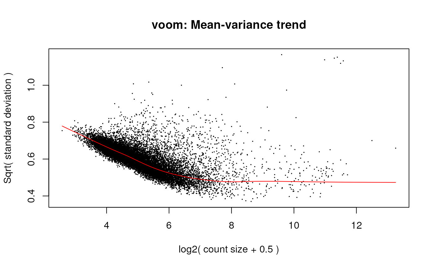
fit <- lmFit(v)

fit_contrast <- contrasts.fit(fit, contrasts = contr.matrix)

efit <- eBayes(fit_contrast, robust = TRUE)
We can see that in the comparison between glomerulus_abnormal and tubule_neg in DKD patient, we found 472 up-regulated and 365 down-regulated DE genes with fold-change above 1.2 (by default).
results_efit<- decideTests(efit, p.value = 0.05)
summary_efit <- summary(results_efit)

summary_efit
## BvT
## Down 1673
## NotSig 15345
## Up 1657Visualisation
We can obtain the DE results by using the TopTable
function.
library(ggrepel)
library(tidyverse)

de_results_BvT <- topTable(efit, coef = 1, sort.by = "P", n = Inf)

de_genes_toptable_BvT <- topTable(efit, coef = 1, sort.by = "P", n = Inf, p.value = 0.05)
We can then visualise the DE genes with MA plot.
de_results_BvT %>%
  mutate(DE = ifelse(logFC > 0 & adj.P.Val <0.05, "UP",
                       ifelse(logFC <0 & adj.P.Val<0.05, "DOWN", "NOT DE"))) %>%
  ggplot(aes(AveExpr, logFC, col = DE)) +
  geom_point(shape = 1, size = 1) +
  geom_text_repel(data = de_genes_toptable_BvT %>%
                    mutate(DE = ifelse(logFC > 0 & adj.P.Val <0.05, "UP",
                       ifelse(logFC <0 & adj.P.Val<0.05, "DOWN", "NOT DE"))) %>%
                    rownames_to_column(), aes(label = rowname)) +
  theme_bw() +
  xlab("Average log-expression") +
  ylab("Log-fold-change") +
  ggtitle("B cell zone vs. T cell zone in Lymph node (limma-voom)") +
  scale_color_manual(values = c("blue","gray","red")) +
  theme(text = element_text(size=15))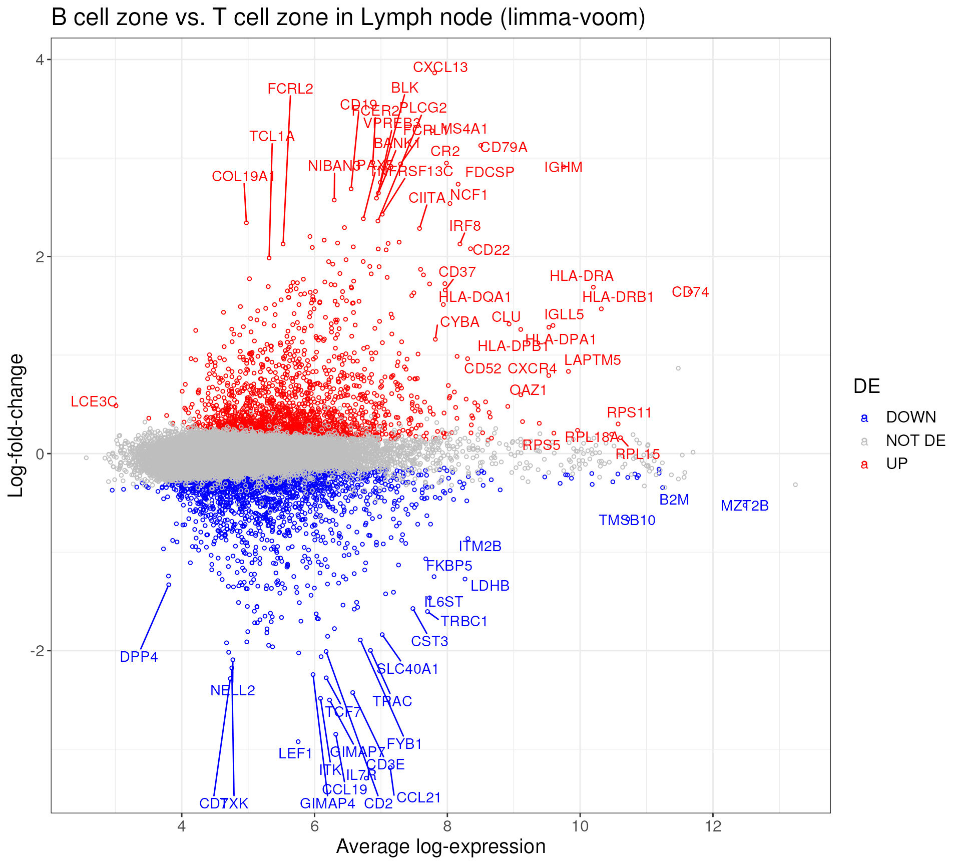
Or we can make a interactive table using the DT
package.
library(DT)

updn_cols <- c(RColorBrewer::brewer.pal(6, 'Greens')[2], RColorBrewer::brewer.pal(6, 'Purples')[2])

de_genes_toptable_BvT %>%
  dplyr::select(c("logFC", "AveExpr", "P.Value", "adj.P.Val")) %>%
  DT::datatable(caption = 'B cell zone vs. T cell zone in Lymph node (limma-voom)') %>%
  DT::formatStyle('logFC',
                valueColumns = 'logFC',
                backgroundColor = DT::styleInterval(0, rev(updn_cols))) %>%
  DT::formatSignif(1:4, digits = 4)
GSEA and visualisation with vissE
For users who are interested in whether some specific genes are DE in the contrast, you can extract them from the DE tables. However, if there isn’t a specific list of genes, users can proceed to perform a gene sets enrichment analysis (GSEA) to find out the enriched gene sets, which might indicate relevant or interest biological patterns.
There are many ways to perform GSEA, here we try to do GSEA with the
DE genes using fry from the limma package.
We select the following gene sets to conduct gene set enrichment analysis:
- MSigDB Hallmarks - genesets from the hallmarks collection of MSigDB
- MSigDB C2 - genesets from the C2 collection of MSigDB which contains curated genesets such as those obtained from databases such as BioCarta, KEGG, PID, and Reactome, and from chemical or genetic perturbation experiments
- GO BP - biological processes from the gene ontology database
- GO MF - molecular functions from the gene ontology database
- GO CC - cellular component from the gene ontolgoy database
FDR < 0.05 indicates significantly enriched gene set.
Load Gene sets
We load the gene sets using the msigdb package, and
extact only the gene sets we described above. This might take a few
minutes to run.
library(msigdb)
library(GSEABase)

msigdb_hs <- getMsigdb(version = '7.2')
msigdb_hs <- appendKEGG(msigdb_hs)

sc <- listSubCollections(msigdb_hs)

gsc <- c(subsetCollection(msigdb_hs, c('h')),
  subsetCollection(msigdb_hs, 'c2', sc[grepl("^CP:",sc)]),
  subsetCollection(msigdb_hs, 'c5', sc[grepl("^GO:",sc)])) %>%
  GeneSetCollection()
Enrichment analysis
Preprocessing is conducted on these genesets, filtering out genesets
with less than 5 genes and creating indices vector list for formatting
on the results before applying fry.
fry_indices <- ids2indices(lapply(gsc, geneIds), rownames(v), remove.empty = FALSE)
names(fry_indices) <- sapply(gsc, setName)

gsc_category <- sapply(gsc, function(x) bcCategory(collectionType(x)))
gsc_category <- gsc_category[sapply(fry_indices, length) > 5]

gsc_subcategory <- sapply(gsc, function(x) bcSubCategory(collectionType(x)))
gsc_subcategory <- gsc_subcategory[sapply(fry_indices, length) > 5]

fry_indices <- fry_indices[sapply(fry_indices, length) > 5]

names(gsc_category) = names(gsc_subcategory) = names(fry_indices)
Now we run fry with all the gene sets we filtered.
fry_indices_cat <- split(fry_indices, gsc_category[names(fry_indices)])
fry_res_out <- lapply(fry_indices_cat, function (x) {
  limma::fry(v, index = x, design = design, contrast = contr.matrix[,1], robust = TRUE)
})

post_fry_format <- function(fry_output, gsc_category, gsc_subcategory){
  names(fry_output) <- NULL
  fry_output <- do.call(rbind, fry_output)
  fry_output$GenesetName <- rownames(fry_output)
  fry_output$GenesetCat <- gsc_category[rownames(fry_output)]
  fry_output$GenesetSubCat <- gsc_subcategory[rownames(fry_output)]
  return(fry_output)
}

fry_res_sig <- post_fry_format(fry_res_out, gsc_category, gsc_subcategory) %>%
  as.data.frame() %>%
  filter(FDR < 0.05)
The output is a data.frame object. We can either output
the whole table, or inspect the top N gene sets in a bar plot.
We can see many immune-related gene sets are significantly enriched, B cell-related gene-sets are enriched in up-regulated genes while T-cell related gene-sets are enriched in down-regulated genes.
fry_res_sig %>%
  arrange(FDR) %>%
  filter(Direction == "Up") %>%
  .[seq(20),] %>%
  mutate(GenesetName = factor(GenesetName, levels = .$GenesetName)) %>%
  ggplot(aes(GenesetName, -log(FDR))) +
  geom_bar(stat = "identity", fill = "red") +
  theme_bw() +
  coord_flip() +
  ggtitle("Up-regulated")
fry_res_sig %>%
  arrange(FDR) %>%
  filter(Direction == "Down") %>%
  .[seq(20),] %>%
  mutate(GenesetName = factor(GenesetName, levels = .$GenesetName)) %>%
  ggplot(aes(GenesetName, -log(FDR))) +
  geom_bar(stat = "identity", fill = "blue") +
  theme_bw() +
  coord_flip() +
  ggtitle("Down-regulated")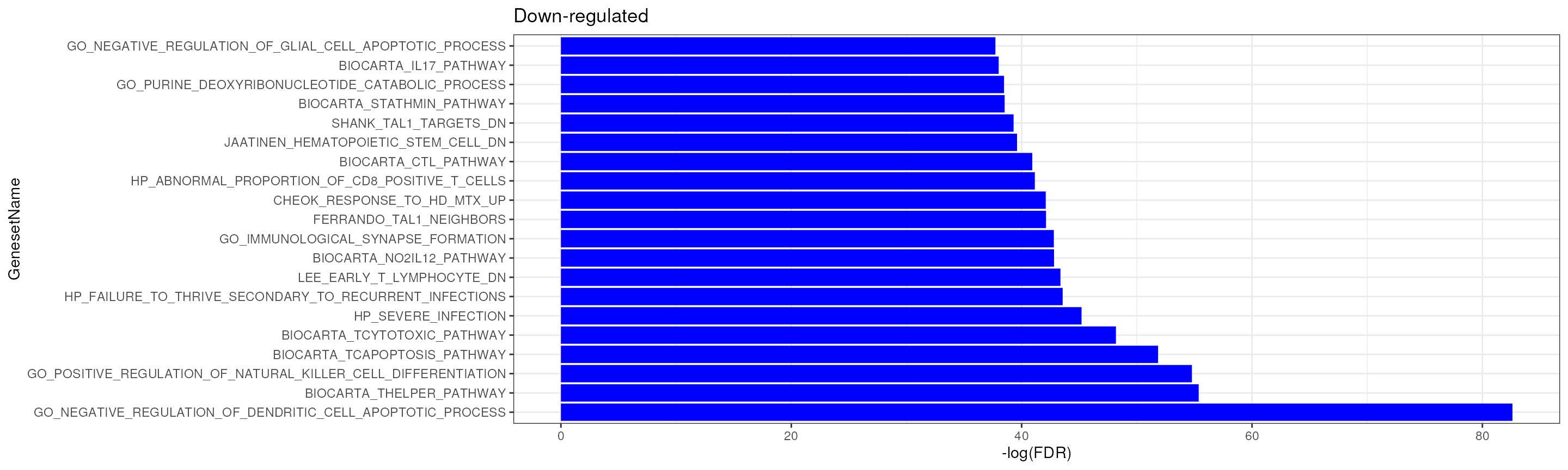
Visualization
An alternative way to summarise the GSEA output is to visualise common gene sets as a group.
We can use the igraph and vissE package to
perform clustering on the enriched gene sets and visualise the gene sets
using word cloud-based algorithm and network-based visualisation. For
more information about vissE, check out here.
library(vissE)
library(igraph)
dovissE <- function(fry_out, de_table, topN = 6, title = "", specific_clusters = NA){

  n_row = min(1000, nrow(fry_out))
  gs_sig_name <- fry_out %>%
    filter(FDR < 0.05) %>%
    arrange(FDR) %>%
    .[1:n_row,] %>%
    rownames()
  gsc_sig <- gsc[gs_sig_name,]

  gs_ovlap <- computeMsigOverlap(gsc_sig, thresh = 0.15)
  gs_ovnet <- computeMsigNetwork(gs_ovlap, gsc)

  gs_stats <- -log10(fry_out[gs_sig_name,]$FDR)
  names(gs_stats) <- gs_sig_name

  #identify clusters
  grps = cluster_walktrap(gs_ovnet)
  #extract clustering results
  grps = groups(grps)
  #sort by cluster size
  grps = grps[order(sapply(grps, length), decreasing = TRUE)]

  # write output
  output_clusters <- list()
  for(i in seq(length(grps))){
    output_clusters[[i]] <- data.frame(geneset = grps[[i]], cluster = paste0("cluster",names(grps)[i]))
  }
  output_clusters <<- output_clusters %>% bind_rows()

  if(is.na(specific_clusters)){
    grps <- grps[1:topN]
  } else {
    grps <- grps[specific_clusters %>% as.character()]
  }

  #plot the top 12 clusters
  set.seed(36) #set seed for reproducible layout
  p1 <<- plotMsigNetwork(gs_ovnet, markGroups = grps,
                        genesetStat = gs_stats, rmUnmarkedGroups = TRUE) +
    scico::scale_fill_scico(name = "-log10(FDR)")

  p2 <<- plotMsigWordcloud(gsc, grps, type = 'Name')

  genes <- unique(unlist(geneIds(gsc_sig)))

  genes_logfc <- de_table %>% rownames_to_column() %>% filter(rowname %in% genes) %>% .$logFC
  names(genes_logfc) <- de_table %>% rownames_to_column() %>% filter(rowname %in% genes) %>% .$rowname

  p3 <<- plotGeneStats(genes_logfc, gsc, grps) +
    geom_hline(yintercept = 0, colour = 2, lty = 2) +
    ylab("logFC")

  #p4 <- plotMsigPPI(ppi, gsc, grps[1:topN], geneStat = genes_logfc) +
  #  guides(col=guide_legend(title="logFC"))

  print(p2 + p1 + p3 + patchwork::plot_layout(ncol = 3) +
          patchwork::plot_annotation(title = title))

}
A typical vissE analysis produces three plots:
A word-cloud, a network and a gene statistic plot. The word-cloud plot performs a text-mining analysis to automatically annotate gene set clusters (top 9 in this case, ordered by cluster size and the -log10 of the FDR);
The network plot visualises gene sets as a network where nodes are gene-sets and edges connect gene-sets that have genes in common;
Gene statistic plots visualise a gene-specific statistic (a log fold-change in this case) for all genes that belong to gene-sets in the cluster against the number of gene-sets that gene belongs to.
Combined, these three plots enable users to identify higher-order biological processes, characterise these processes (word-clouds), assess the relationships between higher-order processes (network plot), and relate the experiment-specific statistics back to the identified processes (gene statistic plot), thereby providing an integrated view of the data.
dovissE(fry_res_sig, de_genes_toptable_BvT, topN = 9, title = "B cell zone vs. T cell zone in Lymph node." )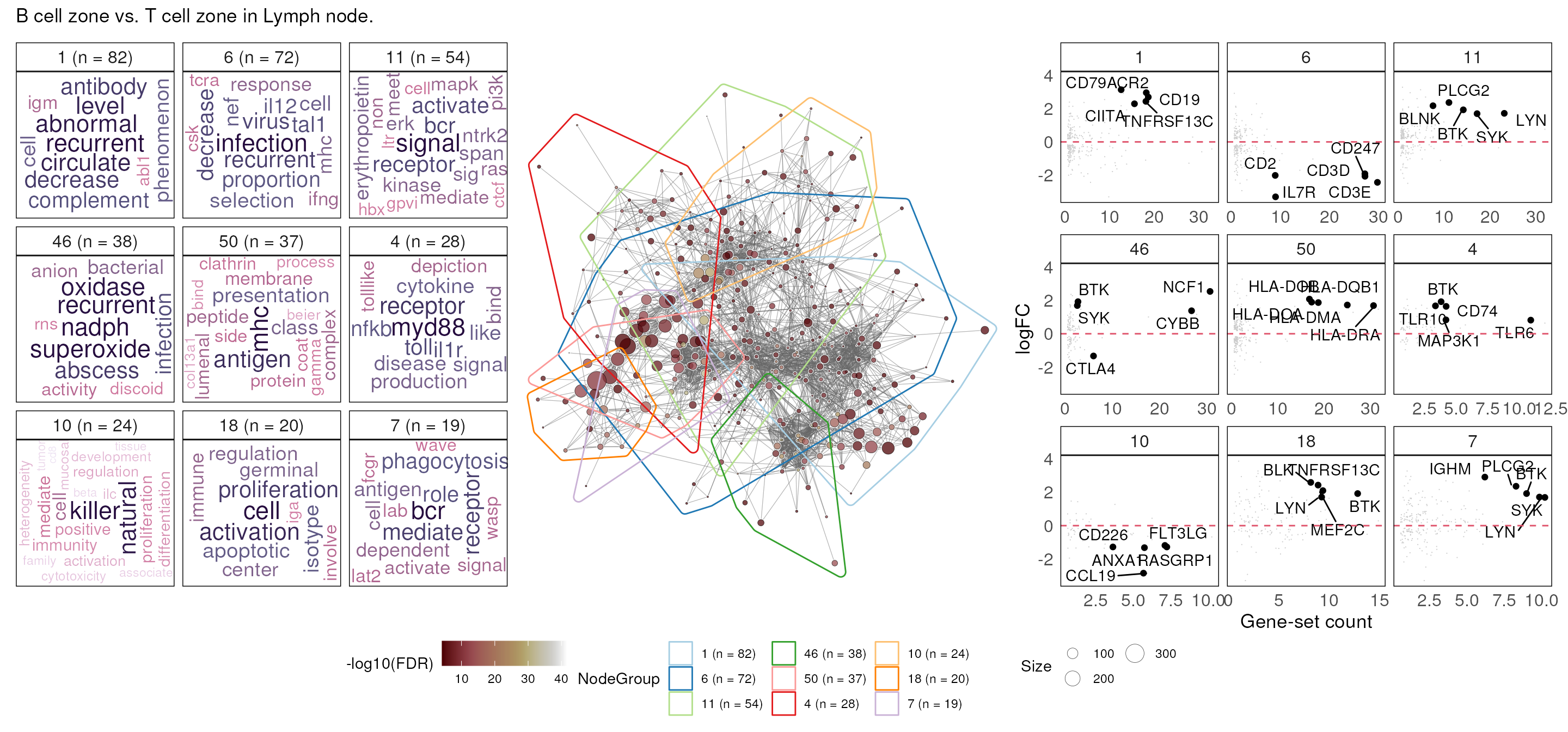
Cellular deconvolution
Instead of performing DE analysis on the GeoMx data, we can also perform cellular deconvolution analysis.
Cellular deconvolution (or cell type composition or cell proportion estimation) is a technique that estimates the proportions of different cell types in samples collected from a tissue.
In the standR package, we can use the
prepareSpatialDecon function for communicating the
SpatialExperiment object to the R package
SpatialDecon to perform cellular deconvolution. However,
since SpatialDecon requires negative probes to establish
background for the data, we need to re-construct the
SpatialExperiment with parameter rmNegProbe
set to FALSE to disable the removal of negative probes, then re-run the
QC steps.
library(SpatialDecon)

spe <- readGeoMx(countFile, sampleAnnoFile, featureAnnoFile, rmNegProbe = FALSE)

spe <- addPerROIQC(spe, rm_genes = TRUE)

qc <- colData(spe)$AOINucleiCount > 150

spe <- spe[, qc]

spe_tmm <- geomxNorm(spe, method = "TMM")
spd <- prepareSpatialDecon(spe_tmm)The output object from the prepareSpatialDecon has two
matrix, one is the normalised count (here we used the TMM-normalised
count), second is the background model for deconvolution.
names(spd)## [1] "normCount" "backGround"Then we can follow the guide from SpatialDecon
to perform deconvolution.
Here we use the cell type profile from the SpatialDecon
package.
The “SafeTME” matrix, designed for estimation of immune and stroma cells in the tumor microenvironment. (This matrix was designed to avoid genes commonly expressed by cancer cells; see the SpatialDecon manuscript for details.)
data("safeTME")

heatmap(sweep(safeTME, 1, apply(safeTME, 1, max), "/"),
        labRow = NA, margins = c(10, 5))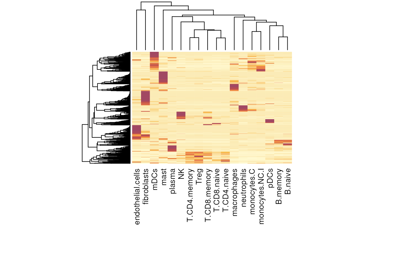
Now we can perform deconvolution using spatialdecon
function.
res <- spatialdecon(norm = spd$normCount,
                   bg = spd$backGround,
                   X = safeTME,
                   align_genes = TRUE)
We can then visualize the outcomes. Because we have too many samples from this datasets, we subset it to focus on tissue fragments from T cell zone and B cell zone.
samples_subset <- colnames(spe_tmm)[colData(spe_tmm)$Type %in%  c("T cell zone", "B cell zone")]

subset_prop <- res$prop_of_all[,samples_subset]

spe_sub <- spe_tmm[,samples_subset]
We can use the bar plot to visualise the proportion distribution of cell types in each sample.
subset_prop %>%
  as.data.frame() %>%
  rownames_to_column("CellTypes") %>%
  gather(samples, prop, -CellTypes) %>%
  ggplot(aes(samples, prop, fill = CellTypes)) +
  geom_bar(stat = "identity", position = "stack", color = "black", width = .7) +
  coord_flip() +
  theme_bw() +
  theme(legend.position = "bottom")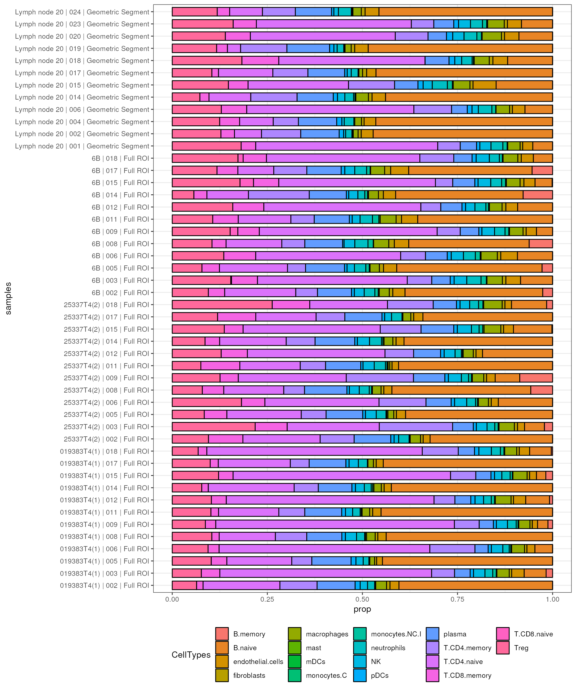
Differential proportion analysis
To perform differential analysis on proportion data, we use the
propeller tool from the speckle package.
Propeller is a robust and flexible linear modelling-based solution to test for differences in cell type proportions between experimental conditions, more information please see the propeller paper.
We first need to use the convertDataToList function to
transfer the proportion data, i.e. the cell type deconvolution result,
into the data that can be used by propeller.
propslist <- convertDataToList(subset_prop,
                               data.type = c("proportions"),
                               transform="asin",
                               scale.fac=colData(spe_sub)$AOINucleiCount)
Similar to using limma to perform DE analysis, propeller
takes a model.matrix to conduct statistical test.
design <- model.matrix(~ 0 + Type + SlideName, data = as.data.frame(colData(spe_sub)))

colnames(design) <- str_remove(colnames(design), pattern = "Type") %>%
  str_replace_all(., " ", "_")

contr <- makeContrasts(B_cell_zone - T_cell_zone,levels=design)


outs <- propeller.ttest(propslist, design, contr, robust=TRUE,trend=FALSE, sort=TRUE)
Finally, we can visualise the results in violin plots. In this case, as expected, comparing B cell zone to T cell zone tissue fragments from the human lymph node, we can observe more naive B cells in B cell zone and more naive T cells in T cell zone.
diff_ct <- outs %>%
  filter(FDR < 0.05) %>%
  rownames()

colData(spe_sub)$samples_id <- rownames(colData(spe_sub))

subset_prop[diff_ct,] %>%
  as.data.frame() %>%
  rownames_to_column("CellTypes") %>%
  gather(samples, prop, -CellTypes) %>%
  left_join(as.data.frame(colData(spe_sub)), by = c("samples"="samples_id")) %>%
  ggplot(aes(Type, prop, fill = CellTypes)) +
  geom_violin() +
  facet_wrap(~CellTypes) +
  theme_bw() +
  xlab("") +
  ylab("Proportion")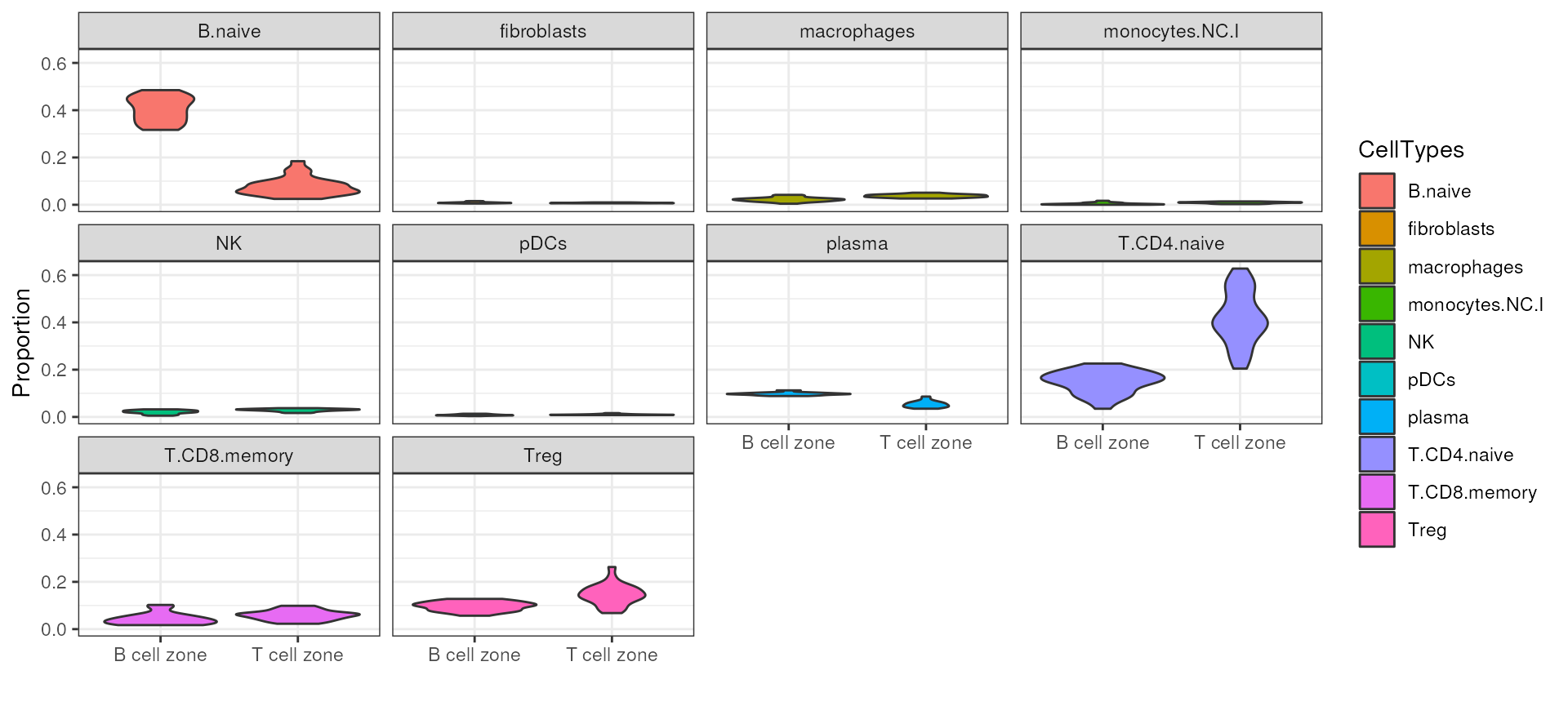
Summary
The analysis of the GeoMx transcriptomics data requires several steps
of quality control to ensure the data is of good quality for performing
downstream analyses like differential expression analysis with pipelines
such as edgeR, limma-voom or
DEseq2. The bioconductor package standR
provides multiple functions for conducting QC and normalization for the
GeoMx DSP datasets.
Packages used
This workflow depends on various packages from version 3.18 of the Bioconductor project, running on R version 4.3.2 (2023-10-31) or higher. The complete list of the packages used for this workflow are shown below:
## R version 4.3.2 (2023-10-31)
## Platform: x86_64-pc-linux-gnu (64-bit)
## Running under: Ubuntu 22.04.3 LTS
##
## Matrix products: default
## BLAS:   /usr/lib/x86_64-linux-gnu/openblas-pthread/libblas.so.3
## LAPACK: /usr/lib/x86_64-linux-gnu/openblas-pthread/libopenblasp-r0.3.20.so;  LAPACK version 3.10.0
##
## locale:
##  [1] LC_CTYPE=en_US.UTF-8       LC_NUMERIC=C
##  [3] LC_TIME=en_US.UTF-8        LC_COLLATE=en_US.UTF-8
##  [5] LC_MONETARY=en_US.UTF-8    LC_MESSAGES=en_US.UTF-8
##  [7] LC_PAPER=en_US.UTF-8       LC_NAME=C
##  [9] LC_ADDRESS=C               LC_TELEPHONE=C
## [11] LC_MEASUREMENT=en_US.UTF-8 LC_IDENTIFICATION=C
##
## time zone: Etc/UTC
## tzcode source: system (glibc)
##
## attached base packages:
## [1] stats4    stats     graphics  grDevices utils     datasets  methods
## [8] base
##
## other attached packages:
##  [1] speckle_1.2.0               SpatialDecon_1.12.0
##  [3] igraph_1.5.1                DT_0.30
##  [5] ggrepel_0.9.4               ggalluvial_0.12.5
##  [7] msigdb_1.10.0               GSEABase_1.64.0
##  [9] graph_1.80.0                annotate_1.80.0
## [11] XML_3.99-0.15               AnnotationDbi_1.64.1
## [13] vissE_1.10.0                lubridate_1.9.3
## [15] forcats_1.0.0               stringr_1.5.0
## [17] dplyr_1.1.3                 purrr_1.0.2
## [19] readr_2.1.4                 tidyr_1.3.0
## [21] tibble_3.2.1                ggplot2_3.4.4
## [23] tidyverse_2.0.0             edgeR_4.0.1
## [25] limma_3.58.1                SpatialExperiment_1.12.0
## [27] SingleCellExperiment_1.24.0 SummarizedExperiment_1.32.0
## [29] Biobase_2.62.0              GenomicRanges_1.54.1
## [31] GenomeInfoDb_1.38.1         IRanges_2.36.0
## [33] S4Vectors_0.40.1            BiocGenerics_0.48.1
## [35] MatrixGenerics_1.14.0       matrixStats_1.1.0
## [37] standR_1.6.0
##
## loaded via a namespace (and not attached):
##   [1] R.methodsS3_1.8.2             vroom_1.6.4
##   [3] koRpus_0.13-8                 lexicon_1.2.1
##   [5] goftest_1.2-3                 Biostrings_2.70.1
##   [7] vctrs_0.6.4                   spatstat.random_3.2-1
##   [9] digest_0.6.33                 png_0.1-8
##  [11] textclean_0.9.3               koRpus.lang.en_0.1-4
##  [13] deldir_1.0-9                  parallelly_1.36.0
##  [15] syuzhet_1.0.7                 magick_2.8.1
##  [17] MASS_7.3-60                   pkgdown_2.0.7
##  [19] reshape_0.8.9                 reshape2_1.4.4
##  [21] httpuv_1.6.12                 scico_1.5.0
##  [23] withr_2.5.2                   sylly.en_0.1-3
##  [25] xfun_0.41                     survival_3.5-7
##  [27] ggpubr_0.6.0                  ellipsis_0.3.2
##  [29] memoise_2.0.1                 prettydoc_0.4.1
##  [31] commonmark_1.9.0              ggbeeswarm_0.7.2
##  [33] systemfonts_1.0.5             zoo_1.8-12
##  [35] ragg_1.2.6                    pbapply_1.7-2
##  [37] R.oo_1.25.0                   GGally_2.1.2
##  [39] KEGGREST_1.42.0               promises_1.2.1
##  [41] httr_1.4.7                    rstatix_0.7.2
##  [43] fitdistrplus_1.1-11           globals_0.16.2
##  [45] miniUI_0.1.1.1                generics_0.1.3
##  [47] curl_5.1.0                    zlibbioc_1.48.0
##  [49] ScaledMatrix_1.10.0           ggraph_2.1.0
##  [51] polyclip_1.10-6               GenomeInfoDbData_1.2.11
##  [53] ExperimentHub_2.10.0          SparseArray_1.2.2
##  [55] interactiveDisplayBase_1.40.0 xtable_1.8-4
##  [57] desc_1.4.2                    evaluate_0.23
##  [59] S4Arrays_1.2.0                BiocFileCache_2.10.1
##  [61] hms_1.1.3                     irlba_2.3.5.1
##  [63] ggwordcloud_0.6.1             colorspace_2.1-0
##  [65] filelock_1.0.2                ROCR_1.0-11
##  [67] NLP_0.2-1                     spatstat.data_3.0-3
##  [69] reticulate_1.34.0             readxl_1.4.3
##  [71] lmtest_0.9-40                 magrittr_2.0.3
##  [73] later_1.3.1                   viridis_0.6.4
##  [75] lattice_0.22-5                spatstat.geom_3.2-7
##  [77] future.apply_1.11.0           scattermore_1.2
##  [79] scuttle_1.12.0                cowplot_1.1.1
##  [81] RcppAnnoy_0.0.21              pillar_1.9.0
##  [83] nlme_3.1-163                  compiler_4.3.2
##  [85] beachmat_2.18.0               RSpectra_0.16-1
##  [87] stringi_1.7.12                tensor_1.5
##  [89] minqa_1.2.6                   plyr_1.8.9
##  [91] crayon_1.5.2                  abind_1.4-5
##  [93] scater_1.30.0                 locfit_1.5-9.8
##  [95] sp_2.1-1                      graphlayouts_1.0.2
##  [97] org.Hs.eg.db_3.18.0           bit_4.0.5
##  [99] codetools_0.2-19              textshaping_0.3.7
## [101] BiocSingular_1.18.0           crosstalk_1.2.0
## [103] bslib_0.5.1                   slam_0.1-50
## [105] textshape_1.7.3               plotly_4.10.3
## [107] tm_0.7-11                     mime_0.12
## [109] splines_4.3.2                 markdown_1.11
## [111] fastDummies_1.7.3             Rcpp_1.0.11
## [113] dbplyr_2.4.0                  sparseMatrixStats_1.14.0
## [115] cellranger_1.1.0              gridtext_0.1.5
## [117] knitr_1.45                    blob_1.2.4
## [119] utf8_1.2.4                    BiocVersion_3.18.0
## [121] lme4_1.1-35.1                 fs_1.6.3
## [123] listenv_0.9.0                 DelayedMatrixStats_1.24.0
## [125] Rdpack_2.6                    ggsignif_0.6.4
## [127] Matrix_1.6-2                  statmod_1.5.0
## [129] tzdb_0.4.0                    tweenr_2.0.2
## [131] pkgconfig_2.0.3               pheatmap_1.0.12
## [133] tools_4.3.2                   cachem_1.0.8
## [135] R.cache_0.16.0                rbibutils_2.2.16
## [137] RSQLite_2.3.3                 viridisLite_0.4.2
## [139] DBI_1.1.3                     numDeriv_2016.8-1.1
## [141] fastmap_1.1.1                 rmarkdown_2.25
## [143] scales_1.2.1                  grid_4.3.2
## [145] ica_1.0-3                     Seurat_5.0.0
## [147] broom_1.0.5                   AnnotationHub_3.10.0
## [149] sass_0.4.7                    patchwork_1.1.3
## [151] FNN_1.1.3.2                   BiocManager_1.30.22
## [153] dotCall64_1.1-0               carData_3.0-5
## [155] RANN_2.6.1                    farver_2.1.1
## [157] tidygraph_1.2.3               mgcv_1.9-0
## [159] yaml_2.3.7                    ggthemes_4.2.4
## [161] cli_3.6.1                     leiden_0.4.3
## [163] lifecycle_1.0.4               uwot_0.1.16
## [165] backports_1.4.1               BiocParallel_1.36.0
## [167] timechange_0.2.0              gtable_0.3.4
## [169] rjson_0.2.21                  ggridges_0.5.4
## [171] textstem_0.1.4                progressr_0.14.0
## [173] parallel_4.3.2                jsonlite_1.8.7
## [175] RcppHNSW_0.5.0                bitops_1.0-7
## [177] bit64_4.0.5                   Rtsne_0.16
## [179] NanoStringNCTools_1.10.0      spatstat.utils_3.0-4
## [181] BiocNeighbors_1.20.0          GeomxTools_3.5.0
## [183] SeuratObject_5.0.0            logNormReg_0.5-0
## [185] jquerylib_0.1.4               highr_0.10
## [187] R.utils_2.12.2                lazyeval_0.2.2
## [189] shiny_1.7.5.1                 ruv_0.9.7.1
## [191] htmltools_0.5.7               sctransform_0.4.1
## [193] sylly_0.1-6                   rappdirs_0.3.3
## [195] glue_1.6.2                    spam_2.10-0
## [197] XVector_0.42.0                RCurl_1.98-1.13
## [199] mclustcomp_0.3.3              rprojroot_2.0.4
## [201] repmis_0.5                    gridExtra_2.3
## [203] EnvStats_2.8.1                boot_1.3-28.1
## [205] R6_2.5.1                      ggiraph_0.8.7
## [207] labeling_0.4.3                cluster_2.1.4
## [209] nloptr_2.0.3                  DelayedArray_0.28.0
## [211] tidyselect_1.2.0              vipor_0.4.5
## [213] ggforce_0.4.1                 xml2_1.3.5
## [215] car_3.1-2                     future_1.33.0
## [217] qdapRegex_0.7.8               rsvd_1.0.5
## [219] munsell_0.5.0                 KernSmooth_2.23-22
## [221] data.table_1.14.8             htmlwidgets_1.6.2
## [223] RColorBrewer_1.1-3            spatstat.sparse_3.0-3
## [225] rlang_1.1.2                   spatstat.explore_3.2-5
## [227] lmerTest_3.1-3                uuid_1.1-1
## [229] fansi_1.0.5                   beeswarm_0.4.0
Acknowledgments
We would like to thank Ahmed Mohamed and Dharmesh Bhuva for their efforts on the Bioconductor submission of the standR package, and would like to thank Jinjin Chen and Malvika Kharbanda for their helps in the standR workshop of the ABACBS 2022 conference.